Employment Trends in Australia

Aussie labour market still underperforming – March 2017

Overall, the Australian labour market is still underperforming. Employment growth has fallen below the peaks of 2014 and 2015 and is still well below recent growth benchmarks.  There are some areas of “better” performance as of the March 2017 data, but two points put into question whether we are on the path to an improved labour market. First, despite the more recent pickup in employment growth, the current increase in participation is leading to an increase in the number of unemployed persons. While there is a reason to give this the benefit of the doubt, it does appear that employment growth is not high enough to absorb those workers returning to the labour force. Secondly, the welcomed and positive shift to greater growth in full-time employed persons has not been confirmed by the growth in full-time hours worked. Growth in aggregate hours worked has slowed throughout the March quarter.

The top-line seasonally adjusted number was strong – employment grew by +60k persons. This is the largest (seas adjusted) monthly increase since October 2015. I always look at the trend data though, and that was good for the month too. The annual seasonal reanalysis was completed in February, so this changed the ‘shape’ of many trends between the February and March data, but at least our benchmark for 2017 has been set.

Labour market is still underperforming…

Across different measures and benchmarks, the Australian labour market continues to underperform.

First, the trend in the annual growth highlights just how much the growth in employed persons has slowed in the space of the last year.

In March 2016, the total number of employed persons grew by 250k persons (annual) – in March 2017, that growth has slowed to +122k persons. Total unemployed persons are increasing again as more people come back into the labour market:-


Source: ABS

On the positive side, the annual growth in total employed persons has started to improve over the last 3 months. More on this shortly.

Second, annual growth in employed persons is sitting well below the 10-year average benchmark.

The 10 year average measures the average annual growth (in 000’s persons) for March over the last 10 years. The current annual rate of growth in employed persons (at March 2017) is +122k persons versus the average over the last 10 years of +189k.

Source: ABS

This is much worse when you break out full-time (FT) numbers. Annual growth in FT employed persons was a mere +25k persons versus the 10 year average of +102k persons. On the flipside, part-time (PT) employment growth is performing just above the 10-year average, +97k annual growth in PT employed persons versus +86k for the 10-year average. The current annual growth in total unemployed persons is now above the 10-year average – which is not a good thing.

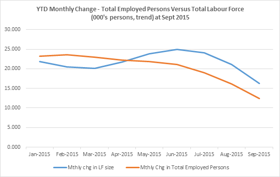
Third, the current growth in the number of employed persons is below that of the labour force.

Comparing the gap between the growth in employment and growth in the total labour force is an interesting way to gauge the ‘strength’ of employment growth. The result of employment growing slower than the labour force is an increase in the number of unemployed persons.

Source: ABS

For most of 2015 and the first half of 2016, employment grew by a greater number than the labour force and unemployment fell as a result. The (now negative) gap between employment and labour force growth since Sept 2016 is not the widest it has ever been, but it does mark a shift to a more negative trend.

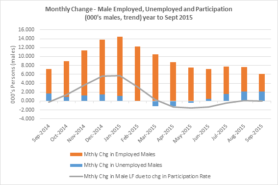
One way to view changes in the labour force size is by looking at what population growth adds and the impact +/- of changes in the participation rate. Over the last four (4) months there has been a shift to people coming back into the labour force and it’s this increase in participation that has contributed to the growth in the labour force:-

Source: ABS, The Macroeconomic Project

The exact reason why people are coming back (or left in the first place) into the labour force cannot be answered by this data.

Comparing employment growth to LF growth suggests that employment is not growing fast enough to ‘absorb’ those people coming back into the labour market. It could be a timing issue. Participation has been increasing over the last four months and the current median duration of job search in Australia is 12 weeks (unchanged from a year ago) so it might take a few more months of data to gauge whether unemployment continues to accelerate. But the fact that the median duration of job search hasn’t changed suggests that there hasn’t been much, if any, tightening in the labour market -the same median job search duration suggests that it is neither easier nor harder to find a job overall.

Finally, while employment growth has improved recently, the distribution of that growth among the states has not been broad based.

The annual growth in employed persons has been concentrated in VIC. The problem is that some of the states that had previously been bigger drivers of employment growth (NSW, QLD and WA) have completely underperformed versus the 10-year average:-

Source: ABS

Smaller states have performed better with regard to employment growth – NT, TAS, ACT and SA all performed above the 10yr average but most of that growth has been PT employment (which is still better than no growth).

Are we on the path to a better labour market performance? Have we turned the corner?

There is some evidence of more positive shifts in the labour market performance, but it is mixed.

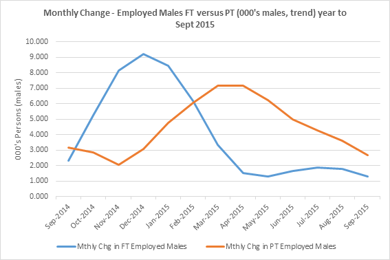
A better sign is that on a National level, one of the more negative trends in the labour market appears to have reversed in the last five months. Full-time employment is now growing faster than part-time. I say this has been a negative trend because the underemployment ratio at an all-time high suggests that many are turning to PT work out of necessity and actually want more hours of work.

Over the last five months, FT employed persons has grown faster than PT. Below is the monthly change over the last two years:-

Source: ABS

But again, the distribution of this growth in FT employment, especially in this latest quarter is limited. Only two states have contributed to the bulk of this growth in FT jobs – VIC and WA.

Across the states in the latest quarter:-

  • NSW – PT job losses are driving the overall decline in employment for the quarter and FT employment growth has not been high enough to offset this decline. FT employ growth +3.7k persons and PT employed persons -8.6k
  • VIC – FT employment growth +14.1k persons and PT employed persons +1.8k
  • QLD – growth in PT employment has exceeded FT growth in the last 3 months but the trend for FT employment growth is looking positive. Growth in FT employed persons +3k and +10k PT employed persons
  • SA – growth in PT employment has exceeded FT and the trend has become more negative over the last few months. Growth in FT employed persons +0.3k and growth in PT employed persons +3.1k
  • WA – accounted for the largest growth in FT employment across all states – growth in FT employed persons +14.9k offsetting a decline in PT employed persons of -8.2k
  • TAS – an overall positive performance with +0.4k FT employment growth and +0.6k PT employment growth
  • NT – growth in FT employed persons +1.8k and +1.6k PT employed persons
  • ACT – growth in PT employment is just offsetting the decline in FT employment in the latest quarter. FT employed persons -1.2k and +1.3k PT employed persons

The turnaround in employment growth in QLD and WA is notable and NT continues to punch above its weight in the latest quarter. This is to be expected to a certain degree given the rebound in our main export commodity prices. But given these levels of employment growth, only in WA, TAS and NT has unemployment declined in the latest quarter.

While it is a better sign that FT employment has grown (increased income), PT employment growth has unfortunately been slowing and this has impacted overall employment growth in the last few months – the total growth each month (FT+PT) is still well below that of the peaks of 2014 and 2015.

Despite the shift to greater FT versus PT employment growth, the underemployment ratio has continued to rise:-

Source: ABS

In other words, a growing proportion of employed persons (9.1%) wants and is available for more hours. This is an important sign of how much slack still exists in the labour force and possibly how households might be coming under greater income pressure.

There is also a question mark over the rate of growth in FT employed persons – there has been a divergence between the growth in FT employed persons and the growth in FT hours worked over the last few months. 

There has been growth in the number of FT employed persons yet FT hours worked have been slowing and then declining month on month over the last four months:-

Source: ABS

It creates some doubt over which measure is the more accurate representation of the labour market – FT employment growth or FT hours worked?

Seeing hours worked grow faster than employed persons is easier to explain i.e as demand increases, it’s easier/faster/lower risk for firms to extend overtime hours of existing employees rather than expand the workforce, which takes longer. But it’s more difficult to see how we can be adding more FT employed persons, yet FT hours worked are declining. It doesn’t seem to be simply a timing issue – past data shows that the timing of the two measures is fairly consistent, with both measures turning at a similar time. In the chart above, the divergence has been occurring for most of the last half of 2016 and 2017 YTD.

No such divergence exists between the growth in PT employed persons and the monthly decline in PT hours worked:-

Source: ABS

Growth in PT employed persons and PT hours worked have slowed throughout the last half of 2016 to zero growth as of March.

Either way, there is a concerning trend that aggregate hours worked in the economy slowed throughout the March quarter.

Across most measures, the labour market is still underperforming. Employment growth is low, unemployment is increasing, under-employment is still increasing and hours worked is slowing.


Australian labour market conditions continue to weaken – Oct 2016

There are, unfortunately, several concerning trends coming out of the October 2016 labour market report. Employment on a National level is declining, annual full-time (FT) employment is declining, part-time (PT) employment growth is slowing and the size of the labour force is declining as a result of falling participation. On the surface it looks like the falling number of unemployed persons is a bright spot in the report. That would be great if it was so, but falling participation is likely masking a higher number of unemployed persons. We don’t know the exact reasons why people are leaving the labour force, but I’m more likely to take a negative view of this outcome due to the number of declining employed persons. The implications of a weak labour market for private sector growth and budget outcomes is important. Slowing private sector credit growth, rising mortgage interest rates and a weak labour market is a combination that doesn’t bode well for private sector growth in Australia.

As always, I use trend data to analyse the labour force. The data points will move around from month to month, but it’s the broader trends that are important to focus on.

Annual growth in employed persons has slowed from +290k in Oct 2015 to +108k in Oct 2016

What a difference a year makes.

The chart below shows how employment growth has been distributed over the last 36 months. The most negative change has occurred over the last 12 months (if you add the monthly change for each of the last 12 months, you’ll get the annual change in employed persons of +108k).

The monthly growth in employed persons has slowed from a peak of +33k in Sept 2015 to National employment declining by -1k persons in the latest month.

Source: ABS

There are two important points about this chart.

Firstly, even though employment growth is declining, it is declining slower than the labour force. This means that, despite the point that employment is declining, the total number of unemployed persons is also declining. This is the labour market situation in a nutshell at the moment. Rather than be counted as ‘unemployed’, people are leaving the labour market and participation is falling. Declining unemployment isn’t a clear sign of an improving labour market when both employment and labour force participation are also declining.

There is a second important point. Declining National employment, even on a monthly basis, is a relatively rare event. Below is the monthly change in total employed persons going back to 1979 – there are only seven (7) periods where National employment declined on a monthly basis:-

Source: ABS

Since 1979, the periods when the monthly change in employed persons was negative were – 81/82, 90/91, 2000, 2003, 2008, 2013 and now. While only two of these periods were officially ‘recessions’, it easy to link each of these periods back some more general economic weakness. The most recent period of ‘weakness’ during 2012/13 (ToT falls/end of mining investment phase, GFC fiscal stimulus was wearing out and the impact of the European sovereign debt crisis), prompted the RBA to cut rates twelve (12) times, or 325bps, between Nov 2011 and Aug 2016. This helped indebted households as well as residential construction and the real estate market. We no longer have twelve rate cuts available to deal with any economic weakness.

Clearly, this current episode of declining employment is not anywhere near the severity of previous periods. But the direction remains concerning.

It would be easy to argue that this is a ‘one month’ data point and is more likely to result in revision in the following month due to the nature of the trend data. But you can break down this National employment trend to FT and PT trends and further still, down to state trends, to see that this is not a recent phenomenon. Some of the larger states have recorded declining employment well before the most recent month – NSW since August 2016, QLD since Jan 2016 and WA since Apr 2016. Employment growth in ACT has just started to dip into negative territory.

The number of FT employed persons declined by 50k over the last year

This is a disturbing part of this current labour market situation – the persistent decline in FT employed persons throughout 2016. This has been the driver behind the decline in overall employment.

Source: ABS

Growth in FT employed persons has been slowing since Sept 2015, turned negative in Jan 2016 and has stayed negative since. Until Sept 2016, the decline in FT employed persons was at least off-set by the growth in PT employed persons. The growth in PT employed persons peaked back in May 2016. Since then, growth in PT employed persons has been slowing such that the decline in FT employment equalled and exceeded any PT employment growth in the last two months. If there is a glimmer of hope, its that the cycle of decline in FT employed persons may have peaked in Sept looking at the chart above.

The state data shows how widespread the decline in FT employed persons has been. On an annual basis, only VIC, SA and ACT have seen any growth in FT employment. But in the latest quarter, the state picture worsens – only SA recorded any FT employment growth:-

Source: ABS

Australia is becoming increasingly reliant on part-time employment. Of total employed persons, 32% are PT employed – this is the highest proportion of PT workers in the data history. The underemployment rate has reached a new high in the August 16 quarter of 8.6%, highlighting that an increasing proportion of the labour force are available for and want more hours of work. It’s a telling point that suggests the shift to PT is not entirely by choice.

Unemployment is declining…but so is labour force participation

In the latest month, total unemployed persons declined by a further 4.15k persons. In the last 12 months, the total number of unemployed persons declined by -45k persons.

Source: ABS

This should be a great highlight of the labour force data – the falling number of unemployed persons. But we are in a situation where employment is declining at a slower rate than the labour force. Going back to the first chart in this post highlights this relationship:-

Source: ABS

The difference between the blue line (employment) for Oct 16 (-1.05k) and the orange line (total labour force) for Oct 16 (-5.2k) equals the monthly change in unemployed persons of -4.15k. As mentioned, this declining unemployment isn’t a clear/consistent sign of an improving labour market when both employment and labour force participation are also declining.

Labour force participation falls to 64.5% – almost back to where it was ten years ago

The other way to measure the changes in the labour force is to estimate what population growth adds to the labour force plus changes in participation. This perspective highlights the severity of the current round of declines in the labour force participation:-

Source: ABS, The Macroeconomic Project

As mentioned in previous posts, its best to ignore the two most recent estimates for underlying population growth – they are always low for the most recent months.

In the last year, I’ve estimated that underlying population growth has added approx. 185k persons to the labour force and the decline in participation has resulted in -122k persons leaving the labour force. This equals the annual growth in the labour force of +63k persons. On a monthly basis, the labour force size has been declining for the last 3 months – driven by declines in participation.

As of Oct 2016, the labour force participation rate is 64.5% – almost back to where it was ten years ago. Since Dec 2015, participation has declined sharply and I estimate this resulted in -125k persons leaving the labour force since then. This has been driven by both male and female workers leaving the labour force, but mostly males (-78k males left the labour force over the last year).

Source: ABS

The decline in participation is potentially masking the real rate of unemployment. If over the last year, participation had remained constant, and employment had continued to fall, it would mean that our unemployment rate could have been as high as 6.5% – not the 5.6% that is quoted. The important point here though is that we don’t know exactly WHY people are leaving the labour force. I’ve previously looked at the decomposition of participation declines by age and gender and by state to at least understand whether we are seeing ‘boomers’ retiring from the labour force or if there was a geographic element to the trends. It will be worthwhile revisiting this analysis once updated data is available.

Looking at the state distribution of participation rate changes shows that the bigger changes in participation have occurred in key mining states such as WA and QLD, but participation is down in all states except VIC on an annual basis:-

Source: ABS

Part of the reason for the fall in participation in WA & QLD is likely to be the result of workers transitioning to other states or jobs as the more labour-intensive investment phase of the mining boom continues to wind down. The latest quarter data suggests some improvement with participation higher in VIC, TAS & NT.

Hours worked confirms the FT and PT employment growth

Hours worked continued to grow for PT employed persons and continued to fall for FT employed persons:-

Source: ABS

The trend in hours worked still looks lacklustre. Even though there is growth in PT employed persons, the growth in PT hours worked is only just above the longer term average. The year on year change (decline) in FT hours worked is well below the longer term average growth in FT hours worked.

Implications

The implications on spending and taxation are large.

We are a few weeks away from understanding the impact of the weakening labour market on tax receipts at the MYEFO. We are well into the first half of the 2016/17 budget year and wages are growing below growth assumptions, participation was forecast to remain at 65% – it’s now fallen to 64.5% and employment was forecast to grow at 1.75% and so far, on a seasonally adjusted basis, employment has fallen by -0.21%. It’s going to take quite a shift in activity to see these trends reverse and accelerate higher by the end of the financial year.

The household budget/income seems vulnerable right now:-

  • Employment has started declining
  • The ongoing shift from FT to PT employment will likely result in lower household income
  • Continued slowing wage growth, where real wages are not increasing fast enough (on aggregate) to sustain the same level of disposable income

The other important source of spending growth in the economy is credit – and private sector credit (driven by business) is not accelerating. This suggests lower private sector growth and employment growth in the near term.

None of this would be a problem, except that we are more indebted than ever before – and we are now also looking down the barrel of rising interest rates. Rising mortgage interest rates will impact those households with variable rate mortgages. If deposit rates also rise, then it will help those with some interest income.

Growth in new credit decelerates – March 2016

The update to the Australian Debt & the Credit Impulse page has now been posted – you can read the results in more detail including background on the credit impulse measure on that page.

The latest data shows that for the total private sector, growth in new credit is decelerating.

The annual growth in new credit has slowed from $27.2b in February to $23.3b in March 2016. This has been predominantly driven by the deceleration in new mortgage plus other personal credit growth.

Source: RBA, The Macroeconomic Project

The performance of the components making up total private credit are mixed.

Business – The growth in new credit for business has accelerated slightly from $14.7b in Feb to $16.6b in Mar. Despite a few up and down periods, the overall trend since June 2015 has been accelerating credit growth. But it hasn’t been a very steep curve and this point matters. Since June 2015, the growth in new credit has accelerated from $7.4b to $16.6b over the ten (10) month period. Compare this to the first ten (10) months from the May 13 bottom where the growth in new credit for business accelerated from -$33.6b to -$1.8b in ten (10) months – a much bigger move and a clearly steeper curve. The implication is the steeper the curve, the higher the growth in new credit which means more growth in spending by business. There was a clear pickup throughout the economy during that time, especially evident in the turnaround in the labour market as business increased hiring. For the moment, the slower acceleration means more of a steady course in activity, rather than implying stronger growth in the near term.

The pick-up in credit acceleration for business in the latest month, and if it continues to improve, may be a better sign for labour market conditions in the near future.

Mortgage plus Other Personal – Unfortunately, the slightly more positive acceleration in new credit for business has been more than offset by the deceleration in the growth of new mortgage plus other personal credit. The chart above includes ‘other personal’ to provide a more consistent trend given the large adjustments made in both data sets. This measure has decelerated from +$12.3b in Feb to +$6.6b in March. Both mortgage and other personal contributed to that deceleration. Growth in new credit for mortgages decelerated from +$27.6b in Feb to $23.4b in Mar (-$3.9b). Other personal also decelerated from -$15.3b in Feb to -$17b in Mar. The deceleration in new mortgage credit continues to imply lower growth in house prices in the future. There has also been a loose relationship with retail sales and mortgage growth throughout these last few years of higher house price growth, so the deceleration is likely to affect spending in these areas as well.

You can read more details here.

Labour market performance among states is shifting – Feb 2016

The latest labour force data for February 2016 was released last week. Despite the issues around the data, it remains one of the most important pieces of information about the economy. The February release continues to show that employment growth is slowing and has virtually caught up to the slowing labour force growth at a National level. As the gap between employment and labour force growth narrows, the rate of decline in unemployment has been slowing. In this post though, I want to highlight the state based results. There are some sobering insights around the performance of various state labour markets, most notably in NSW. As in a previous post, looking at the state based results is a proxy for tracking the transitioning of the economy. As employment growth in key mining states, such as WA, has been fading, NSW and to a lesser extent, VIC, had been more than offsetting the declines. In fact NSW has accounted for the majority of the National employment growth, especially full time employment, over the last year. This looks to changing.

National overview

National employment growth has continued to slow along with the growth in the labour force. The current cycle of slowing employment growth does not seem to have bottomed yet.

Source: ABS

The narrowing gap between employment growth and labour force growth means that the decline in unemployment is also slowing.

The slowing growth in employment has been driven by slower growth in both full time (FT) and part time (PT) employed persons.

Source: ABS

The slowing of FT employment growth means that both FT and PT employ growth are now at similar levels again.

State labour market indicators

The state employment growth data annual versus latest quarter highlights the degree to which performance among the states has started to shift.

Source: ABS

Over the last year, NSW had ‘over-performed’ in terms of employment growth – the state accounted for 57% of the National growth in employment yet represented 32% of all employed persons. QLD was the only other state that had over-performed on an annual basis in terms of share of employment growth – QLD accounted for 24% of the National annual employment growth and 20% of all employed persons in Australia.

In the latest quarter though, these numbers have shifted. Share of employment growth in NSW is now on par with its share of employed persons – 33% of National employment growth in the latest qtr. QLD now accounts for 33% of National employment growth in the latest quarter, well above its 20% share of employed persons. Vic comes in third, accounting for 28% of National employment growth in the latest quarter, just above its 25% share of all employed persons.

The National employment growth engine has stalled – NSW

The NSW picture becomes more concerning when you break down that employment growth into FT and PT share. In the last year, NSW accounted for a large 86% of the National FT employment growth, well above its 32% share of all FT employed persons.

In the latest quarter, FT employment in NSW has declined.

This is a large turnaround in performance:-

Source: ABS

In the latest quarter, its only VIC and QLD that are making relatively large contributions to National FT employment growth. The other notable state is SA where FT employment has shifted from declining on an annual basis to stabilizing in the latest quarter.

In NSW, the decline in FT employment has not been offset by any increase in PT employment growth either. Furthermore, PT employment growth in NSW appears to have plateaued. The trend looks poor:-

Source: ABS

Despite the fact that FT employment has declined in the last 2 months, total employment is still growing in NSW at just above that of the labour force:-

Source: ABS

This means that unemployment is still falling in NSW. The unemployment rate in NSW has fallen by -0.15%pts in the latest quarter. If you were to just look at the unemployment rate, you’d be misled into thinking that the labour market in NSW was performing OK. But as the gap between employment and labour force growth becomes smaller, it means that the decline in unemployment is also slowing.

VIC – employment growth is still holding on

In VIC, employment data was revised upward from the previous month. The Jan 2016 release had growth of total employed persons in VIC for Jan at 2.0k persons. That Jan growth figure has now been revised up to 4.4k persons. The underlying trend is such that growth in FT employed persons appears to have peaked back in Nov 15 and PT employment growth has been declining since late 2015.

Source: ABS

The overall growth in employed persons in VIC has fallen below that of the labour force and, as a result, unemployment is now growing again in VIC.

QLD – the new growth engine?

QLD is the only other state where employment growth appears to be relatively strong. But the monthly trend shows that PT growth has taken a negative turn. As well, FT employment growth in QLD appears to have plateaued, albeit at a relatively high level:-

Source: ABS

Growth in employment overall remains higher than that of the labour force (that gap is narrowing though), hence unemployment continues to fall in QLD.

Labour market performance in other states

The other states are not showing positive signs of employment growth. Overall employment growth in SA has slowed to that of the labour force in the latest month – this has been driven by a slowdown in growth of PT employed persons (which is no longer growing in the latest month). In TAS, FT and PT employed persons has been declining for over 5 months and that decline has been higher than the labour force growth, so unemployment has started to grow again. Employment has been declining in NT for nine months, in line with the labour force, hence the unemployment change has been small. In the ACT, employment growth has peaked back in Nov 2015, but because the labour force growth has been slowing faster than employment growth, unemployment has been declining.

I’ll cover the labour market in WA shortly.

Unemployment indicators

Across the states, the decline in unemployment has started slowing and, in some states, unemployed persons has started growing again in the more recent time frames:-


Source: ABS

The most notable negative shift has been in VIC. The most notable positive shift has been in WA.

Unemployment rates can be misleading – the case of WA

Quoting an unemployment rate alone can be misleading which is why I never do it on this blog. Take for example, the labour market in WA. According to the previous chart, unemployment has been declining in WA based on the 6mth and latest quarter data. Just looking at the unemployment rate, it appears that unemployment peaked back in Oct 2015 at 6.3%. The unemployment rate in WA has fallen further to 6.1% as of Feb 2016. But this hardly looks like a robust labour market.

In WA, employment is declining, driven by declining numbers of FT employed persons. The growth in PT employed persons has not offset the decline in FT employed persons.

The reason why unemployment is falling in this scenario is that the labour force is declining faster than employment:-

Source: ABS

The declining labour force is the result of falling population and participation in WA. In other words, workers are leaving the state due to a lack of job opportunities, especially in mining. As the size of the working population shrinks, so does demand (for everything) and so does tax revenue.

Labour force – population shifts between the states

Part of what is driving some of these state trends is the shift that has taking place in labour force growth by state.

Source: ABS

The shift from NSW-led growth in the labour force to VIC and QLD-led in the more recent quarter is obvious. Its unclear what is driving slowing labour force growth in NSW. The problem facing VIC now is that employment growth isn’t keeping pace with this growth in labour market – hence the growth in unemployed persons. This will be one to watch.

In QLD, the growth in the labour force has remained above that of employment growth.

Also worth mentioning is WA (as well as TAS and NT) – where the labour force has declined in the latest quarter.

At a National level, there are two reasons why the labour force growth is slowing:-


Source: ABS, The Macroeconomic Project

The first is that underlying population growth has slowed. The chart above shows that what population adds to the labour force has slowed from over 23k persons/month to just over 15k/month. For the moment, I’m ignoring the last two months estimates of population growth in the chart above – they are always low.

The second is that changes in labour force participation are back to detracting from the labour force i.e. people are leaving the labour force. In fact, in the latest quarter, participation rates only increased in QLD and VIC and held steady in SA.

Sample rotation

This slow-down in the labour market has appeared on the radar quite quickly. It’s worth noting that it could be the result of changes to the ABS survey rotation (the incoming survey group having a lower employment to population ratio than the outgoing sample group), rather than a marked deterioration in activity during this time. I’ll remain cautious and keep checking in each month to see how the trends are shaping up.

There is clearly a shift occurring in the dynamics of the state labour markets. This is important because NSW has been such a large and positive driver of the improved National labour market over the last 18 months. It appears that NSW is no long that employment growth engine. So far, it’s not clear that employment growth in the better performing states of QLD and VIC will make up the difference.

Internet job vacancies point to low employment growth – January 2016

The monthly internet job vacancies data is another indicator of future employment growth. This month internet job vacancies continued to grow at a steady pace of +0.4% trend and 0% seasonally adjusted. While there has been a trend of growing vacancies, it does appear to have slowed over the last few months. This does not suggest high, or accelerating, growth in employment over the next few months. But the internet vacancy index has been tracking along like this for a while now – and employment growth continued to outperform.

Source: Dept of Employment 24 Feb 2016 (left hand axis = # of vacancies index)

The Dept of Employment gathers the data on job ads from 3 main job search websites – CareerOne, Seek and Australian Job Search (AJS). It suggests that the index in early 2015 was understating the growth in vacancies:-

“Over the five months to August 2015, there was a reduction in the number of new job advertisements listed on the Australian JobSearch (AJS) website. This may have been as a result of the transition of employment services from Job Services Australia to jobactive. The number of job advertisements listed on AJS began to recover in September; however, the data in this report should be used with caution.” Source: Dept of Employment, 24 Feb 2016

However, the current level of the internet vacancy index (IVI) is lower than the two previous peaks of 2006-08 (45% lower) and 2009-11 (20% lower). Comparing this to employment growth at those same peaks shows that while the periods of employment growth line up with the periods of increase in the IVI, the relative size of the growth during those periods does not correlate at all:-

Source: ABS

For example, the latest peak in annual employment growth exceeded the previous peak in late 2010 by 4% – yet current vacancies are running at 20% below that corresponding peak in late 2010. It’s difficult to reconcile the relative growth of the two data points.

An interesting aspect of the IVI report is the regional internet vacancy index. It provides some insight into the distribution of internet job vacancies and it seems directionally in line with the state-based analysis of employment growth in my previous post – Is the performance of the labour market really that good?

Change in internet vacancies over the year to January 2016

Source: Dept of Employment

According to the report, the largest % increases in vacancies over the year were recorded in:

“Southern Highlands & Snowy NSW (up by 34.4%), Canberra & ACT (26.1%), Bendigo & High Country VIC (23.4%), NSW North Coast (21.8%), and Ballarat & Central Highlands (21.6%)”

The largest % falls in vacancies over the year were recorded in:

“Bathurst & Central West NSW (down by 44.8%, albeit from a low base), Port Augusta & Eyre Peninsula SA (18.6%), Perth (15.9%), North West Tasmania (13.7%) and Central Queensland (12.8%)”

VIC is the only state where all regions saw an in increase in the IVI over the last year – yet employment growth had been subdued in the last year compared to previous peaks. NSW and QLD were mostly all positive. ACT was positive. But in most regions in WA the growth in the IVI was negative. In all regions in SA, TAS and NT the IVI was negative for the year.

Is the performance of the labour market really that good? January 2016

The labour force data continues to raise more questions about its own methodology than it answers about the performance of the labour force. There remains a very wide 95% confidence interval around the ‘true’ change in employed persons between January and December, which is somewhere between a -65k decline in employed persons and a +50k increase in employed persons. But the 95% confidence interval around the ‘true’ unemployment change figure is now just skirting zero at the lower bound, between -9.6k and +70k. So while the interval is wide, it’s starting to be more likely that unemployment increased in January.

There is a different way to present the data to get an idea of how the market is performing. In this post, I will focus on the difference between the monthly change in employed persons and the monthly change in the labour force during the last year. The reason for looking at the labour market in this way is to gain a different perspective on the drivers behind changes in unemployment and to understand the ‘health’ of employment growth over time – is it accelerating or slowing? This provides a different view on the performance of the labour market by state. All does not seem well in NSW, our main employment growth engine. The labour markets in VIC, WA, TAS and NT are also showing some signs of deterioration. The most positive performance is in QLD and ACT, with SA still mixed.

Overall annual employment growth remains over 300k persons

At this point in time, the labour market still looks like it is performing above average on an annual basis, with employment growth well above the 10 year average for January (+186k). Growth in full-time (FT) employed persons continues to exceed growth in part-time (PT) employed persons and total unemployed persons continues to decline across all time periods.

Source: ABS

What you can’t see from this chart is that the annual growth in employment is skewed to one state, with NSW accounting for 56.3% of the National annual growth in employed persons. NSW represents 32% of all employed persons in Australia.

Unemployment continues to fall, but not in all states

The good news is a bit more limited when it comes to the change in unemployed persons, especially when you break it down on a state by state basis and when you start to look at the performance over more recent time periods. It’s really only NSW, SA and QLD where unemployed persons has continued to fall in any large and meaningful way throughout the year (looking at time periods of six months or less).

It looks like unemployment has started falling in WA in the last quarter as well, but this is a function of the labour force growth slowing faster than employment growth. I’ll come back to this point in more detail shortly.

Source: ABS

The mixed performance of total unemployed persons across the states raises some questions of just how widespread this strong labour market performance really is.

When employment grows faster than the labour force, unemployment falls

This is true even when employment growth is slowing faster than labour force growth, which is what has been happening at a National level over the last 5 months:-

Source: ABS

Employment growth has exceeded labour force growth throughout most of 2015. The positive gap between the two measures since August 2015 equals the decline in total unemployed persons during that time of -28.9k persons.

The trend shows that both the growth in employment and the growth in the labour force has been slowing during that time. Whether this is an enduring trend or not remains to be established. But the gap between the two has been narrowing since October 2015 – which means employment growth is slowing faster than the labour force. If this trend continues over the next few months, unemployment could start to grow again on a National basis.

As an aside, why is labour force growth slowing?

The analysis above looks at the labour force as the sum of all employed persons plus all unemployed persons that are looking for work. Another way to view the labour force is by 1) contribution from population growth and 2) contribution from changes in participation. It seems we are seeing less contribution from participation growth over the last six months:-

Source: ABS

The contribution from growth in participation has more than halved since peaking in August 2015. In the last six months, participation has fallen in VIC, SA, WA, TAS and NT.

I’m less concerned with the apparent drop off in population growth over the last two months. This seems to be a regular feature of the data. But there has been a slow-down in what underlying population growth has added to the labour force since its peak in Feb 2008.

But we live in a country where economic fortunes have differed greatly among the states and is in the process of shifting from the mining-led states back towards to the eastern seaboard. It’s worthwhile looking at each state in a bit more detail to understand this transition.

NSW – the main engine driving the so-called post-mining transition is sputtering

The state of NSW has been the strongest performing state in terms of employment growth during 2015. As mentioned above, NSW alone accounted for over 56% of the annual National employment growth in 2015. The current level of annual growth in employment in NSW is extremely strong in historical terms as well – it’s the highest level of annual employment growth on record for NSW. Previous peaks were between +110k and +120k growth in annual employment. The current level of annual employment growth in NSW is +170k employed persons (Jan 2016). This is almost on par with the National 10 year average in January.

The monthly change in employment growth in NSW has now halved over the last six months from the peak of +17.3k growth in employed persons in May 2015 to +7.9k growth in employed person in January 2016.

Growth in FT employed persons had far exceed growth in PT employment over the last year, with FT employment growth of +142k versus PT employment growth of 28k persons. This has reversed as of December, with PT employment now growing faster than FT on a monthly basis. As of January, FT employment growth has slowed to a very low +2.6k persons – down from the peak of 15.9k as recently as July.

What has ‘saved’ unemployment from growing in NSW is that the labour force growth has also slowed – faster than the slow-down in employment growth.

Source: ABS

Since the peak in labour force growth in June 2015, total unemployed persons has actually declined by 20k in NSW. While this is great news, the gap between the measures is narrowing. This state will be important to watch.

VIC – labour market is deteriorating

There are two problems in VIC. The first is that employment growth during 2015 has been subdued. It’s a big state, representing 25% of employed persons, yet only accounted for 14% of employment growth in 2015. Most of the reason for this seems to be that PT employment has been slowing and is now declining (last 4 months). There are early signs that FT employment may have also peaked in this current cycle. For a short time, unemployment was declining. Which brings me to the second problem. Employment growth has now slowed faster than labour force growth and unemployment has started to increase again in the latest quarter.

Source: ABS

It’s a negative pattern – employment growth is slowing from a low peak and unemployment has started to increase again over the last 3 months.

QLD – labour market performance is good

During 2015, QLD had made a bigger contribution to employment growth than VIC, accounting for 25% of the annual National employment growth. For most of 2015, employment has grown faster than the labour force in QLD resulting in lower unemployment. The trend of the employment growth looks positive too – it has been accelerating. The only thing slowing down employment growth in QLD has been lower PT employment growth. Growth in FT employment is still accelerating.

Source: ABS

Unemployment in QLD continues to fall, but this has slowed to zero in the last two months.

SA – performance has been mixed

Employment in SA has continued to grow, with recent growth on par with previous peaks in growth. But most of the current employment growth has been in PT employed persons, whereas FT employment growth was only positive for the last 4 months of 2015. But at least the growth in PT employment was still higher than the growth in labour force – and unemployment has fallen as a result.

Source: ABS

WA – unemployment falling, but it’s hardly a robust market

This is the frontline of the slowing mining investment engine. While employment has started growing again in the last half of 2015, it is well below recent growth levels.

All of the growth has been PT in nature as well. FT employed persons has declined by 24k persons in the last year, whilst PT employed persons has increased by 28k. Cost cutting continues in earnest, but at least there are PT jobs available.

The decline in the level of unemployed persons is mostly the result of slowing growth in the labour force, rather than strong growth in employment.

Source: ABS

TAS – the labour market has deteriorated

The annual rate of employment growth in TAS has turned negative over the last 3 months. Only for a short period during 2015 was employment growth positive and above the level of growth in the labour force. FT employment continues to decline (-2k FT employed persons), but at least in the last few months there has there been some small level of growth in PT employed persons (not enough to offset the falls in FT employment though).

Source: ABS

Unemployment has started to increase again in the last few months of 2015. The current level of unemployed persons, 17k persons, whilst still elevated, remains below the 2013 peak of 20k persons.

NT – employment is declining and unemployment is miraculously falling

The mining transition continues to hurt NT, with employment declining in the latter half of 2015. Even though employment has been declining on a monthly basis, it hasn’t been declining as fast as the labour force. As a result, the level of unemployment has actually declined over the last six months.

Source: ABS

Just looking at a declining rate of unemployment wouldn’t give you the full story about the labour market in NT.

ACT – labour market is improving

The level of employment growth in ACT had been consistently low throughout 2012-2014. But since the latter half of 2014, and in the latter half of 2015, employment growth has started to accelerate. The current level of employment growth is not high by historical standards, but it’s a good sign that it is accelerating and this is different to many other states. Unemployment has grown on an annual basis because the labour force size has grown faster than employment.

Source: ABS

Another positive sign is that FT employment has overtaken PT employment growth as of October 2015.

It doesn’t take much scratching below the surface to see that in most states, the labour market is no longer as strong as the annual figures suggest. It also highlights the need to review a range of different measures, rather than just relying one figure at a point in time as a gauge of labour market strength. The big watch out at the moment is slowing employment growth relative to the labour force across the bigger population states, especially NSW.

Improved labour market conditions Oct 2015

I normally wouldn’t do a labour market update in consecutive months, but it’s important to set the record straight this month.

The ABS has released the October Labour Force data which now shows a significantly different view of the performance of the labour market during 2015. In my Sept update, I had characterised the labour market as having lost is growth momentum during 2015. Some of the trends I highlighted, in a somewhat sobering labour market update in Sept, have been reversed in the latest data for Oct 2015. It’s not an issue of one ‘outlier’ month of data, it’s that the 2015 YTD data was revised in most cases. For clarity, I am using the trend data series.

The main point from my last two posts was that the annual figures hid some emerging negative trends in the monthly growth statistics. The October data has mostly reversed those more concerning monthly trends. The result is that employment growth is higher and, while employment growth is not accelerating, it has remained consistent throughout 2015 to date. Importantly, employment growth is now higher than that of the labour force, so we are starting to see declines in the level of unemployment. Improvement in participation is still resulting in more workers added to the labour force, but at a slowing rate, due mostly to slowing growth in female participation. There are still a few pockets of concern on a state basis, but nothing as severe as what the Sept data was pointing to.

I’m revisiting the points from my last two posts using the revised data in order to highlight the significance of the change in the ABS data between Sept and Oct and to ensure the analysis reflects the most up to date information.

The Sept data highlighted that on a monthly basis, employment growth had halved since Feb 2015

According to the latest Oct data, employment growth has been averaging 22k a month since Dec 2014. This is far cry from the situation in the Sept data where employment growth had halved since Jan 2015. The chart below compares the same employment growth data from the Sept and Oct releases – the accelerating slow-down in employment growth that was evident in the Sept data is no longer evident in the Oct data.

Source: ABS

The growth in FT employed persons was upgraded by +26k persons YTD, whereas growth in PT employed persons was upgraded by 9k persons for the YTD.

Growth in FT employed persons had also more than halved since Feb 2015

The data released in Oct now shows that growth in FT employed persons has been growing at a much higher level > 10k/month since late 2014.


Source: ABS

The trend still does look like its slowing, but nowhere near the level of deceleration that was evident in the Sept data.

Note that there are still a few states where FT employment is declining in the qtr to Oct 2015 – QLD, SA, NT & ACT.

In Sept, improving levels of unemployment was more a function of labour force growth slowing faster than employment growth

This was the chart I posted in my previous update. I didn’t think that the underlying reasons for the slow-down in unemployment growth, where the labour force growth is slowing faster than employment growth, was a positive indicator. From my previous post:

“This chart also highlights that the overall dynamic of the market is negative – it’s based on slowing growth. To be confident that the economy is growing strongly enough to reduce unemployment, employment growth should be accelerating and be above labour force growth – we aren’t seeing that happen at the moment”

Source: ABS

Fast forward to October. I’ve replicated the chart above using the new data. The new data shows stronger and more consistently high employment growth which is now above growth in the labour force.

Source: ABS

What the new data is telling us is the decline in unemployment is now due to higher employment growth versus the labour force, rather than due to both slowing. But the data does still suggest that this is being helped along by slowing labour force growth. Employment growth isn’t accelerating, but it is still quite high. If participation and population were growing at an increasing rate, then we may not see these improvements in unemployment.

Male employment growth in the short-term looked poor

Using the Sept data, male employment growth had slowed fairly significantly during 2015, especially FT employment growth which had averaged <2k/mth growth since April.

Source: ABS

The chart below highlights how this has now changed in the Oct data. Rather than slowing, growth in FT employed males has been accelerating since May 2015 and is well above PT employment growth. This is a complete turnaround from the situation outlined in Sept – with the exception that male PT employment growth has continued to slow.

Source: ABS

Using the Oct data, the employment situation is looking much better for males. Over the YTD 2015, male participation has improved, employment is growing and unemployment is declining.

NSW driving overall employment growth, especially in the Sept qtr

Even in the revised data, NSW is still the main driver of overall employment growth in Australia. Comparing both the Sept to Oct data for the Sept qtr highlights where the major revisions have occurred.

Source: ABS

The two biggest turnarounds in trend have been in VIC and WA. Employment growth in both states is now starting to accelerate rather than slow or decline.

Employment has grown by a larger degree in the Sept qtr in NSW, VIC, QLD and WA.

Employment growth is still declining in SA and ACT. Employment growth in NT has turned negative in the Oct data release.

The biggest trend change was in VIC. The chart below compares the difference between the two data releases. The latest data (blue line) now has VIC employment growth accelerating. This was a fairly major point from my previous post, given how big and important this state is to the National picture.

Source: ABS

Whilst the level of employment growth in VIC is still low, the trend has improved.

National labour force summary – October 2015

The upshot is that the labour market is looking stronger as of October. Importantly, growth in FT employment is higher than PT across all time periods. The other important feature is that for the first time in 50 months, unemployment is declining on an annual basis.

Source: ABS

The monthly growth trend shows that employment growth remains high, but underlying that remains a slow-down in FT employed persons. It appears that overall employment growth has slowed over the last two months – and this could be a function of the ‘trend’ data series.

Source: ABS

A similar pattern is always evident in the population data in the latest month or two. It usually takes more than two months to establish whether this part of a new trend. The chart below is a good example.

In the latest two months, “what population growth is adding to the LF” (the blue bars) appears to be slowing quickly. But over the YTD, you can see that this component has been fairly stable. We know that population growth is slowing and if we looked at the same chart over a longer time period, slowing population growth is evident since early 2012. But there is no broader market reason for a precipitous decline during the last 2 months.

The other factor impacting growth of the labour force is the change in participation. For the moment, it is slowing growth in female participation that is driving this lower level of contribution of participation to labour force growth.

Source: ABS

Slowing population growth and a slow-down in what participation growth is adding to the labour force is helping to improve unemployment.

The revisions to the labour force data do raise ongoing questions about the data. These issues have been well documented in the past and it seems that the fixes will continue to take time to take effect. The current fluidity of the data highlights the need to benchmark the labour market indicators more broadly.

Labour market by state highlights deteriorating performance – Sept 2015

This is an important follow up to the recently published post on the Australian labour market as at Sept 2015. This post builds on that data by taking a deeper dive into the distribution of the current labour market performance across the states. The nature of this analysis tends to highlight changes in trend much earlier than annual growth figures.

The performance by state, especially more recently, I think, paints a slightly worse picture of the labour market because it highlights how reliant the slowing aggregate figures are on just several states. The states where employment is continuing to grow are NSW, QLD and TAS. Even then, there are caveats attached to NSW and QLD.

Overall, the slow-down in employment growth is most evident across every state except Tasmania. In fact, in states such as VIC, SA, WA, NT and ACT, employment growth has slowed throughout 2015 and has started declining. The labour market performance in Victoria throughout 2015 is most concerning, given its size and importance to the National picture. It’s surprising that this development hasn’t been getting more airtime.

There are a few bright spots throughout the data where, for example, where FT employment is at least growing faster that PT in markets such as WA and Tasmania.

Importantly, the state employment data is consistent with the growth trends in hours worked by state presented in the previous post.

Employment growth in the latest quarter driven primarily by NSW

On an annual basis, the distribution of employment growth across the states looks good, with employment growing across most states except SA. But even on an annual basis, 50% of the National +232k person annual growth in employment is attributed to one state – NSW.

Source: ABS

Employment growth in the latest quarter shows quite a deterioration in this situation (red bars in the chart above).

In the latest quarter, employment declined in Vic, SA and ACT and barely grew in WA & NT. This is consistent with the hours worked data in the previous post.

The trend of this growth over the last 12 months is concerning.

I apologise for this next messy chart – just bear with me. It measures the trend in the monthly change in employed persons by each state. If you add up each of the monthly changes for each state over the last 12 months, you’ll get the National annual employment growth figure of +232k persons. This is one way of looking at the underlying distribution of the annual growth figures.

This chart yields several important insights, the most obvious that employment growth is slowing in most states, notably in the bigger states of NSW and VIC.

Source: ABS

New South Wales

Despite having the highest annual growth in employment of any state over the last 2 years, employment growth in NSW has halved since May ’15. At least most of the employment growth is still driven by full-time (FT) employed persons. Unfortunately the growth of FT employed persons in NSW has also more than halved since May 2015. Growth in part-time (PT) employment has fallen to low levels, averaging <1k growth/month. Growth in the NSW labour force has been faster than that of employment over the last 4 months, so the total number of unemployed persons has started to grow again. Despite looking strong at a discrete point in time, the labour market in NSW seems to have lost some momentum over the last 6 months.

Victoria

Vic has gone from reasonably strong monthly employment growth peaking in Dec 14, to declining employment levels over the last 4 months. If there is any consolation it’s that this decline has not accelerated to the downside –the decline has remained small thanks to slightly higher growth in PT employed persons.

The alarm bells should be ringing regarding the labour market in VIC. Full-time employment has been declining for 6 months and PT employment growth has been <1k persons a month for the last 4 months.

Source: ABS

Unemployment has started growing, but that growth remains low likely due to the significantly lower growth in the labour force at the same time. As a result, the unemployment rate has only been ticking up ever so slightly. The slow-down in labour force growth is partly due to the fall in the VIC participation rate from 65% in Feb to 64.5% in Sept 2015. These data points may have important implications for Victoria – especially the housing market, where Melbourne is the second fastest growing real estate market in Australia.

Queensland

This is the only other state showing any significant level of employment growth (in terms of actual number of persons). The trend in employment growth has been positive for most of 2015 and growth has remained consistent at just below 5k persons/month. Whilst this looks positive in the aggregate, most of this growth has been driven by PT employment growth. Growth in FT employment has been slowing since Feb 2015 and started declining from June 2015. Employment growth has shifted from FT to PT employment and whilst this is not ideal, it’s better than no employment growth. Employment growth has remained higher than growth in the labour force for most of 2015, so unemployment has been falling. In the latest month of Sept 2015, employment growth was only slightly lower than growth in the labour force.

South Australia

At the start of 2015, there were some promising trends in SA employment growth, with total employed persons growing from Jan to May 2015. Unfortunately, employment has now begun to decline again over the last 4 months and has been accelerating to the downside. Driving this trend is a decline in both FT and PT employed persons. Whilst both are declining, the decline in FT employed persons is at least slowing:-

Source: ABS

Unemployment growth has started to slow at the same time – which is likely the result of the labour force declining slightly faster than employment growth in recent months. The unemployment rate in SA is the highest of all states and is now at 8%. There needs to be a fairly significant increase in employment growth in excess of the labour force growth in order to reduce this level of unemployment. It’s no coincidence that we are now talking about the production of submarines and the processing of nuclear fuel rods in SA.

Western Australia

This is an important state in terms of tracking the impact of developments in the mining industry. Employment growth in WA just turned negative in the latest month Sept 2015. The trend of employment growth looks quite concerning (growth has been slowing each month since July 2014 and is now negative) and this fits with the negative outlook for WA. The monthly change in employment over the last five years shows just how much employment growth has slowed in WA:-

Source: ABS

At least more recently, the underlying FT/PT employment growth has shifted to become more positive. Full time employment has started to grow from July 2015, while at the same time PT employment has been declining, which is dragging down the total level of employment growth in WA. Unemployment has been growing, but at a slowing pace – thanks to slowing labour force growth. The annual growth in unemployed persons is tracking well above historical averages.

Tasmania

This state continues to confound. Employment growth in TAS is now the third highest (in terms of actual number of persons, no less!) in Australia in Sept and for the quarter ending Sept 2015. The trend shows that most of this growth is being driven by FT employment growth, while PT employment growth is slightly negative. There is some indication that this trend may be starting to reverse, but it’s too early to tell. Employment continues to grow faster than the labour force in TAS, even while participation continues to increase, resulting in the ongoing decline in total unemployed persons. It’s the only state in Australia at the moment where the labour market looks strong.

Northern Territory

This is another bellwether state for the mining industry. Employment growth has started to decline only in the latest month, driven by declining PT employed persons. The total number of FT employed persons continues to grow, but that growth has slowed throughout 2015. Employment growth overall has been lagging behind labour force growth and as a result, unemployed persons has been growing since Dec 2014.

Australian Capital Territory

Despite a promising start to 2015, total employed persons in the ACT has begun to decline in each of the last 3 months. This decline in employed persons is being driven by declining FT employment, which has been accelerating lower since June 2015. At the same time, PT employed persons has been growing but not fast enough to counter the decline in FT employed persons. As a result, total unemployed persons has been growing again over the last six months.

Employment growth by state is consistent with the growth in hours worked

This overview of employment growth by state is very much in line with the hours worked trends outlined in the previous labour market post. The only markets where hours worked have grown in the latest quarter are NSW, QLD and TAS. This represents a negative shift from the annual data where hours worked only declined in two states – SA and ACT.

Source: ABS

To recap the shifting trends in hours worked data by state:–

  • NSW still strong, but rate of growth is slowing
  • TAS still strong
  • QLD starting to improve in the last two months
  • On the fence – NT hours stalling, slightly declining
  • Worst performers where hours have declined – SA, ACT and WA
  • Hours worked have declined in VIC, but it looks more like a ‘high plateau’ rather than a serious decline at this stage

The short term employment indicators are pointing to a deterioration in performance across most states. These trends are just starting to emerge and, if they continue, could have important implications, especially in states such as VIC. It will be important to keep this state by state view in mind when looking at further developments in areas such as housing credit and house prices. For the moment, I’ll continue to keep track of these trends, as changes in employment levels are an important indicator underpinning consumption and output growth in the economy.

Labour market slowing during 2015

In a recent post (They say we’re in an “income recession”), I highlighted the potential for a negative impact on the labour market due to falling National income. The fall in National income has been primarily driven by falls in profit of the corporate non-financial sector (mostly mining).

“After 3 consecutive quarters of declining company profits, corporates will be under pressure to continue to cut costs. It’s unlikely that the corporate sector will just continue to absorb these falls. The immediate risk is to the labour market and compensation of employees.”

It may take time for this to play out, if indeed it does, but this is important context for looking at the performance of the labour market.

It’s fair to say that the Australian labour market has lost its growth momentum during 2015. It’s not visible looking at the annual figures, but it’s there in the more recent monthly trends which is what I will focus on in this post.

During the first half of 2015, growth in the majority of labour market performance indicators started to slow. Given the shift in employment growth, growth in hours worked has followed a similar trend, but not quite to the same degree – this is an important indicator of domestic economic activity. The resilience of the labour market over the last 18 months or so has provided a base for growth. As long as the labour market holds up, the economy will, in all likelihood, be OK. There is evidence here to suggest that the labour market is starting to slow. Within the context of other economic indicators, such as falling National income, this is not surprising.

There has been a lot of noise about the validity of the labour market reports over the last several years. As usual, I have used the “trend” data series (as opposed to seasonally adjusted or original), which means that from month to month, the data can shift around somewhat. But even though there have been some large revisions to the data during 2015, the major trends have remained intact.

Employment growth is slowing

The main trend that has been consistent throughout the year, is that employment growth has been slowing. To be clear, employment is still growing, it’s growing at a decreasing rate.

Employment growth peaked in February 2015 and has slowed since then, more so for FT (full-time) employment growth.

Source: ABS

Since July 2015, the labour market is now back to the point where PT (part-time) employment growth is exceeding FT employment growth. Monthly employment growth has almost halved since Feb 2015.

On an annual basis (chart below), this slow-down is not yet visible. The annual growth is still recording new recent highs in employment growth of +232k persons for the full year to Sept 2015.

Source: ABS

Unfortunately, even this higher level of annual employment growth is not enough to make a dint in reducing the total number of unemployed persons. As of Sept 2015, growth in total employed persons is still below that of the labour force. This trend has been in place for the most part since the start of 2011:-

Source: ABS, The Macroeconomic Project

Total number of unemployed persons growing again on a monthly basis – now at 780k persons

As a result, unemployment is still growing. Annual growth in total unemployed persons has reached new lows, but is still growing on an annual basis by +16k persons.

Source: ABS

The more concerning part of this trend is that on the month to month basis, growth in total unemployed persons has been increasing again since Feb 2015. Growth in unemployment has slowed slightly in the last 2 months.

Source: ABS

So how can both unemployment and employment growth slow at the same time in the last two months?

At first sight, the slow-down in unemployment growth during Aug and Sept looks to be positive, but it’s more likely a function of employment growth that is slowing less than the labour force growth (in absolute numbers).

The slowing growth in the labour force can be explained by both slowing population growth and slowing growth from improving participation rates over the last three months:-

Source: ABS, The Macroeconomic Project

For example, between July and Sept 2015, growth in the labour force slowed from +24k to +16k persons (a slow-down in growth of approx. -8k persons). I’ve used July because that also coincides with the recent peak in unemployment growth. At the same time, growth in employed persons slowed from +19k to +12k persons (approx. -7k). This means that monthly growth in unemployed persons slowed from +5k to +4k (approx. -1k). This way of looking at the data assumes that unemployment is the outcome when employment growth is lower than labour force growth.

The chart below shows how this dynamic is playing out – slowing labour force growth is likely making the unemployment situation look slightly better.

Source: ABS

The difference between the blue line (labour force growth) and the orange line (employment growth) is the growth in unemployed persons (when the labour force growth is > employment growth). That gap narrowed in the latest month because the labour force growth slowed by a slightly larger number of persons than employment growth.

This chart also highlights that the overall dynamic of the market is negative – it’s based on slowing growth. To be confident that the economy is growing strongly enough to reduce unemployment, employment growth should be accelerating and be above labour force growth – we aren’t seeing that happen at the moment.

The situation is slightly different when you look at the gender split.

Growth in total employed females has only just recently peaked in June 2015. Throughout the early part of 2015, female employment growth was accelerating and growth in total unemployed females was also accelerating. Part of the reason for that was the fairly significant increase in female participation adding workers back into the female labour force at a rate faster than the accelerating employment growth. This seemed like the kind of situation you would expect to see in an improving labour market.

Source: ABS, The Macroeconomic Project

Female participation has now reached all-time highs in Sept 2015. But since June 2015, the female participation rate has started growing at a decreasing rate. This, together with the slow-down in employment growth, means that growth in unemployment is also slowing (a similar dynamic as above).

Males, on the other hand, have not been faring well in the labour market.

Employment growth for males has slowed throughout the year from +13k in January 2015 to +4k in Sept 2015.

Whilst growth in the male labour force has also slowed throughout 2015 (-8.2k males between Jan and Sept 2015), employment growth has slowed by a larger number (-9.2k males). As a result, the monthly growth in unemployed males has increased from +1k/month to over +2k males in Sept 2015. There was a brief time when male unemployed persons actually fell month on month, whilst employment growth was slowing.

Source: ABS, The Macroeconomic Project

The trend for male employment growth in the short-term also looks poor. For the year, employed males grew by +105k persons (+50k FT and +55k PT). Most of this growth came early in the year and employment growth for males appears to have slowed across both FT and PT employment in recent months:-

Source: ABS

Growth in male FT employed persons has now slowed to just above 1,000 persons in the latest month, down from over +9k in Dec 2014.

“Hours worked” mirrors the employment growth trends

Ultimately, growth in hours worked is an important benchmark to understand changes in activity in the domestic economy.

Total hours worked for Sept 2015 were 2% higher than for the same time in the prior year. This is a high point for the annual % growth in hours worked since mid-2012.

Source: ABS

Over the course of the last 12 months though, the trend in growth of hours worked month to month, does seem to mirror that of employment growth, but not quite to the same degree.

Source: ABS

Monthly growth in hours worked has slowed throughout the year, as with employment growth. But over the last 3 months to Sept 2015, that rate of growth picked up somewhat from 0.31% to 0.36%. This growth in hours worked in the last 3 months (versus the 3 months prior) was driven by only two states – NSW & TAS, but mostly NSW.

Source: ABS, The Macroeconomic Project

This is a big shift compared to the larger number of states that contributed to growth in hours worked on an annual basis (NSW, VIC, QLD, SA, WA, TAS and NT).

What the quarterly data doesn’t show is the recent improvement in hours worked in QLD and, at least a slow-down in the rate of decline in hours worked in SA. The monthly trend also shows that the rate of growth in hours worked in NSW is slowing, but it’s still growing strongly enough to drive the National result. Apart from these exceptions, the contribution by state to growth in hours worked over the latest quarter (versus the quarter prior), is a fairly accurate representation showing a slow-down/decline in hours worked across a majority of states.

I will pick up some more detail in state by state trends in a separate post.

The overall picture of the labour force at September is one of weakening momentum. Employment growth has slowed throughout 2015, more so for males and crucially, FT employed persons. Unemployment has also started to grow again throughout 2015. The slow-down in unemployment growth over the last few months is more a result of slowing employment and labour market growth, rather than due to a material improvement in conditions.

A stronger employment market – March 2015

The March labour force report shows far more robust labour market conditions in Australia.

The change from the data in February is the result of the annual seasonal reanalysis by the ABS up to February 2015. The revised data indicates that the labour market has been improving more than previously thought. There are more full-time (FT) employed persons, greater FT employment growth, lower growth in unemployment and improving levels of participation. Employment growth needs to continue to accelerate beyond the current level of labour force growth in order to make continued inroads to reducing unemployment and improving participation. Given the current level of economic growth, it’s difficult to see how this will happen.

The revision – same month, two very different pictures

From the ABS:

“The annual seasonal reanalysis of the Labour Force series was conducted on estimates up to February 2015. The seasonally adjusted and trend estimates in this issue reflect adjustments made as a result of this reanalysis.

While combined seasonal factors for the complete time series are estimated each month, the parameters and prior corrections are reviewed annually at a more detailed level than is possible in the monthly processing cycle. The annual seasonal reanalysis takes into account each additional year’s original data and assesses the appropriateness of seasonal adjustment parameters and prior corrections. The average absolute revisions to seasonally adjusted and trend estimates arising from the 2015 annual seasonal reanalysis were small but larger than those seen in recent annual seasonal reanalyses. This is a result of applying specific adjustments for the changed pattern of supplementary surveys to the entire Labour Force series.”

You can read more here.

Before I get into the usual details of the labour market performance, I wanted to highlight the scale of the change that took place in the data between February and March 2015.

Below, I have taken a snapshot of the major labour market aggregates in February using the February data and then taken the same snapshot of the labour market in February using the revised March data.

According to the February 2015 labour market data, the labour market was showing some signs of improvement, but overall employment growth remained well below the ten year average, running at 75% of the ten year avg. Part time (PT) employment growth was stronger than FT over the short term and unemployment growth remained elevated, especially over the six month period where growth in total unemployed persons was similar to the growth in total FT employed persons. Overall, not great conditions, but also not deteriorating.

(The National summary measures the change/growth in persons across the major employment aggregates)

Source: ABS

Using the March 2015 data, the labour market in February looks decidedly more positive:-

Source: ABS

The major areas of difference are:

  • Additional 32.1k annual growth in FT employed persons
  • Slightly lower annual growth in PT employed persons of -1.7k persons
  • Annual growth in unemployed persons reduced by -8.4k persons, meaning slower growth in total unemployed persons

This is ALL good news. The annual rate of total employment growth is now +182k persons which is 90% of the average annual rate over the last ten years. Total employment growth needs to reach at least that average (which coincides closely with annual population growth) in order to start to reduce the level of total unemployed persons.

The monthly change in employment growth suggests that this improvement started five months ago in November 2014.

Using the February 2015 data, employment growth had accelerated from July 2014. Despite the acceleration in growth, the peak in the most recent expansion, December 2014, was still well below the peak of employment growth in early 2014 and 2013. Growth over the last seven months had been dominated by PT employment growth, but FT employment growth had at least remained steady at around 6.5k – 7k growth over the last 4 months.

Source: ABS

Using the March labour force data, I have recreated the same chart as above up until February 2015. The major differences are evident over the last four months in the chart compared to the one above:-

Source: ABS

Total growth in employed persons over the four months to February is now higher and is also higher than at any time in the last two years. That growth has been driven by FT employed persons rather than PT employed persons – this is a large change and one that is a very positive sign for the economy.

So if the labour market has been improving more than we thought over the last 5 months, does this mean that we should expect to see a corresponding lift in aggregate demand?

The new and improved labour market as at March 2015

Picking up now with a review of where we are as of March 2015 and the view of the employment market is looking much stronger than at any time over the last few years.

Source: ABS

The highlights:

  • This is the first month where unemployment FELL in over 37 months with at least a modest -1k fall in unemployed persons versus February
  • FT employment growth outweighs PT employment growth across all time periods, but has been especially strong over the latest month

Victoria is leading overall employment growth

On a state basis, annual employment growth has been driven by 3 key states – VIC, NSW and WA.

Victoria has rocketed to the lead with annual employment growth of +97k persons, driven mostly by PT employment growth. In fact, PT employment growth in VIC at +65k persons is the highest level recorded in the history of the data series. That said, both PT and FT employment growth numbers are strong.

Source: ABS

In WA, despite the backdrop of falling iron ore prices, shuttering mines and cost cutting, employment growth has edged up into 2nd place above NSW. But beware, this annual figure hides the point that FT employment growth in WA in the latest month versus month is almost zero, and has been trending down over the last few months. Growth in PT employed persons is driving total WA employment growth in the latest months – not a good sign.

Employment growth in NSW is almost entirely driven by FT employment growth.

Source: ABS

Employment growth in states such as QLD, SA TAS, NT and ACT remain at low levels.

Are we seeing the first signs of reduced unemployment?

The total number of unemployed persons in Australia has grown continuously since December 2011 – thirty-seven months. This has been equal to the thirty-seven months of continuous unemployment growth of the last recession in the early 90’s. Whilst the growth in unemployment isn’t as high as “recession times”, the debilitating effect on families, households and individuals is exactly the same.

Although the total number of unemployed persons remains elevated, this was the first month where there was at least a monthly decline in the total number of unemployed persons. The annual rate of growth in unemployed persons is currently at +46k persons, but on a monthly basis, total unemployed persons declined by 1k.

Source: ABS

The slowdown in unemployment growth has been driven by three states – TAS, VIC & SA:-

Source: ABS

At the same time, annual unemployment growth has picked up in NSW, but the more recent monthly numbers show that rate of growth in unemployment in NSW is now slowing. Growth in unemployed persons remains higher in QLD and WA, but growing at a decreasing rate.

But if employment growth has been accelerating, why hasn’t unemployment started falling earlier?

The chart below looks are difference between total employment growth and the growth in the labour force. Where that difference is below zero (chart below), it means that the labour force is growing faster than employment – when this happens, unemployment grows.

The month of March was the first time since Jan 2012 where employment growth was higher than growth in the labour force. The difference equals the decline in unemployed persons.

Source: ABS, The Macroeconomic Project

The reason why unemployment hasn’t started to improve earlier, is that there has been an improving rate of participation, for males at least, over the last 5 months.

The growth in the labour force can be broken down in two ways. The first is by looking at the changes in employment and unemployment. The second is by looking at changes in the working age population and the participation rate. The chart below measures the monthly change in the labour force by looking at population and participation changes (the stacked bars). The line represents the monthly change in total employed persons.

This highlights that while employment growth has been accelerating since July 2014, so has growth in the labour force. BUT, the population element (blue bars) started to slow in Jan ’15 while the growth in the labour force came from an increase in participation.

Source: ABS, The Macroeconomic Project

The last bar in the chart above for March 2015, shows that employment growth was higher than the growth in the labour force. Unfortunately, the subsequent decline in total unemployed persons appears to be due to a slower rate of growth in what population growth is adding to the labour force, rather than a continued acceleration in employment growth.

Improving participation of Males

But it’s still a good news story if participation is improving. One of the hallmarks of the labour market over the last few years has been the declining labour force participation rate. This is a key measure of labour supply – how many people are looking for work or are employed. A declining participation rate has implications for economic output, spending and government tax receipts. It can be an indicator of poor market conditions – reflecting a growing proportion of ‘discouraged workers’. It can also be a structural issue, as is the case facing many countries where populations are ageing. It’s difficult to ascertain the exact reason why workers drop out of the labour force, but you can at least highlight the demographic structural change. Read more here.

Of the 231k annual growth in the size of the labour force at March, 30k was due to an increase in participation. This was due to an improving level of male participation:-

Source: ABS, The Macroeconomic Project

The labour force participation rate has been steadily improving for males, but is still well below the pre-GFC peak.

Source: ABS

The March labour market report shows promising improvement in employment conditions in Australia, especially over the last five months. With most metrics moving in the right direction, the question is whether this momentum can be sustained. Even though employment growth has improved, it needs to continue to accelerate. This will help to resolve two major issues that have plagued the labour markets – falling participation and persistently high unemployment. The question is, where will the stimulus come from to drive this acceleration in employment growth? Lower petrol prices over the last few quarters of 2014 have no doubt provided some boost to consumer spending. But further interest rate cuts will possibly provide relief for more indebted households, rather than provide any real stimulus to non-mining investment. The economy continues to face many headwinds – falling commodity prices, the full impact of the fall in mining investment and slowing credit growth. These are likely to weigh further on economic and employment growth.