Month: January 2014

CPI for Dec ’13 – “higher than expected”

The Consumer Price Index (CPI) for the December 2013 qtr was released last week. According to most media reports, the headline annual number came in “higher than expected”. The CPI is a significant data point because of how it impacts interest rate policy, which is a hot topic at the moment. So now that the Dec 2013 qtr data shows the growth in consumer prices moving into the upper half of the 2-3% band, there is all manner of speculation regarding potential interest increases.

It’s difficult to discuss CPI growth without mentioning monetary policy (interest rates) and the exchange rate. The objective of current RBA monetary policy has been to ‘rebalance’ growth in the economy – to drive growth in non-mining investment to help the economy transition from the resources investment boom. The RBA has lowered its benchmark rate to 1) stimulate greater non-mining investment and 2) break the back of a persistently high $AUD to improve the competitiveness of local manufacturers (and ability to compete with imports locally). The RBA is only just starting to get the lower dollar it has wanted and the dollar needs to presumably remain at this lower level for a while in order to generate the desired results. The problem is that lower dollar is likely to be part of the reason behind the higher annual CPI growth this qtr.

Firstly, a summary of the top line results;-

All Groups CPI (the ‘headline’ number) for December was +0.8% (Dec v Sept ’13 qtr) and +2.7% annual growth (Dec ’13 v Dec ’12). In September 2013, qtrly CPI was +1.2% and annual growth was 2.2%.

The seasonally adjusted CPI for December was +0.9% for the qtr and +2.6% annual growth. In the September qtr the seasonally adjusted CPI was +1.0% and 2.2% annual growth.

Either way you look at it, the result is the same – slightly lower qtrly CPI growth than the prior qtr, but annual growth in CPI moving higher.

The two measures of movements in the core CPI are the trimmed mean and the weighted median – both are used to measure underlying price changes by excluding volatile items. For the December qtr;

Trimmed mean (15% of the smallest & largest price movements are removed or ‘trimmed’) +0.9% for the qtr and +2.6% annual. In the September qtr the trimmed mean grew by +0.7% for the qtr and +2.3% annual.

The weighted median (price change at the 50% percentile by weight of the distribution of price changes) +0.9% for the qtr and +2.6% annual. In the September qtr, the weighted median grew by +0.6% for the qtr and +2.4% annual.

Source: ABS 

Core inflation measures are growing in line with the headline number (qtrly & annually) – which is difficult to see in the above chart. Which means CPI growth is not driven by outlier changes.

Whilst all three measures are well within the RBA’s 2-3% target range, the upward bias is what will have some people concerned. Not that the RBA can or will do anything about the rising CPI. The idea of raising rates at this time would not be good for the Australian economy and goes against the reason why the RBA cut rates in the first place.

During the Jun, Sept and Dec 2011 qtrs the trimmed mean was growing at 2.6%, 2.7% and 2.8% respectively, well into the upper half of the range. This didn’t stop the RBA from commencing cuts to interest rates. CPI growth promptly slowed once interest rate cuts commenced, driven by offsetting low(er) growth in the tradable component.

So far though, interest rate cuts have done little to boost non-mining investment, with the exception of housing finance, which is on its highs again. Unemployment and underemployment continues to grow – which, if it continues, will start to have a greater impact on consumer spending. There are only modest indications that the lower dollar is helping manufacturing. The AIG PMI for Dec ’13 showed that contraction resumed in manufacturing. The latest NAB Business Conditions Survey for Dec highlighted another decline in manufacturing business conditions and makes a special note that many are facing higher purchasing costs as a result of the lower dollar. Capacity utilization remains low in manufacturing (73%), but hasn’t deteriorated further. This low capacity utilisation, together with weak forward orders for manufacturing (-7) suggest little likelihood of capex growth in the near term.

So what are the sources of the growth in the CPI?

The following series measures the change in the contribution, by group, to the CPI.

Source: ABS 

There were four (4) main contributors to CPI growth in the December qtr –

Recreation & Culture (+0.24) – of which domestic travel & accommodation was the majority of the change. Note that there was not a big difference in the contribution between the Sept & Dec qtr (chart above). But the composition of the growth changed in the latest qtr. In the Sept qtr, International travel & accommodation was the bigger contributor to the CPI change. International holiday travel and accommodation continues to be a large contributor (albeit lower than in the Sept qtr) and domestic travel and accommodation has now become a bigger contributor to growth.

Housing (+0.12) – contribution of housing to CPI growth was significantly lower in the Dec qtr due to lower utilities and property rates and charges. There appears to be some seasonality related to utilities price changes (increases happen in the Sept qtr). The contribution of +0.12pts in the Dec qtr was due to changes in rents and the purchase of new dwellings by owner occupiers – both were in line with the increases of the previous qtr.

Alcohol & Tobacco (+0.12) – this was higher in Dec due to a 12.5% increase on cigarettes (from Dec 1 2013 and this price increase will be in effect each year for four years). Alcoholic beverages also saw an increase.

Food & Non-alcoholic Bevs (+0.25) – this was higher in the Dec qtr due to increases in fruit and veg prices.

There were very few categories that off-set these contributions to growth. One category that did not have as big an impact in the Dec qtr, as it did in the Sept qtr was the Transport category, namely, automotive fuels. It was one of the few categories to slightly offset price increases.

Contribution to the CPI over the full year by group;

Source: ABS 

Over the full year, housing, alcohol & tobacco and recreation & culture were the key contributors to CPI change.

Another way to look at the CPI is by looking at the breakdown between tradable and non-tradable categories. This provides some insight as to the extent to which price changes are attributable to domestic factors (changes in labour costs, productivity) or international factors such as exchange rate movements or changes in supply and demand in overseas markets.

Currency Movements
Before going into this detail, it’s worthwhile reviewing the movements of the AUD over this last period of interest rate cuts.

Depreciation in the AUD has been a major objective for the RBA over the last several years. RBA governor Glenn Stevens, “told the AFR in December that he would prefer the dollar closer to US$0.85c” (AFR, “80c ‘magic spot’ for $A” 25-27 Jan 2014). From the same article, “RBA board member, Heather Ridout says the dollar needs to fall to a “magic spot” between US$0.80 and US$0.85″. Under a FOI request, the RBA released documents on 28th January 2014 “discussing what the RBA regards as appropriate levels for the exchange rate considering the needs of the economy”.

At the time of writing the Aussie dollar is at US$0.8809.

We started to see the exchange rate fall during the June qtr 2013;-

Source: RBA 

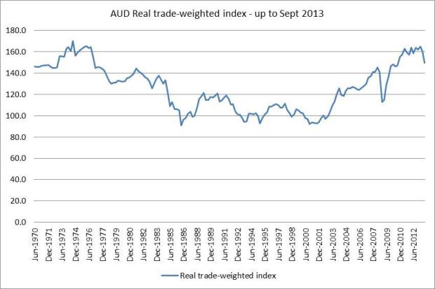
In the June 2013 qtr, the AUD fell by 11%, in the Sept qtr +1.3% and in the Dec qtr fell again by -4.8%. I’ve very simply taken the value of the $AUD at the start and end of the quarters to calculate the change.

On real trade weighted basis, we only started to see the big fall in the currency in the September qtr 2013 – this is the spike down in the latest observation below. This represented 6.6% depreciation.

Source: RBA

From the RBA – “The ‘Real trade-weighted index’ is the average value of the Australian dollar in relation to currencies of Australia’s trading partners adjusted for relative price levels, using core consumer price indices from these countries”. This likely provides a more accurate view of the impact of dollar movements on tradable CPI.

CPI Components – Tradable and Non-tradable

Again, looking at tradable and non-tradable components is another way to gauge the source of pricing pressures in the economy – and may be even more relevant as the AUD continues to fall against the USD.

A brief explanation of the two measures is below;

  • Tradable component – items whose prices are largely determined on the world market (approx. 40% of CPI by weight). Items are classified as ‘tradable’ if imports or exports represent at least 10% of supply of an item. The ‘total supply’ of an item is domestic production plus imports
  • Non-tradable component – the remaining categories (60% of CPI by weight), mostly services.

This view of the CPI continues to show pockets of pricing pressure in Australia. Annual growth in the non-tradable component of the CPI is running at 3.7%, slightly lower than where it has been. This higher non-tradable component has been offset by the (relatively) lower tradable component since mid-2011. But that situation has been changing recently:-

Source: ABS

Whilst the rate of growth in the non-tradable category has been fairly consistent, the rate of growth in the tradable category has been increasing since the June 2013 qtr. Given the depreciation of the AUD over the last year, it was likely that there would be some impact on price growth in the tradable category.

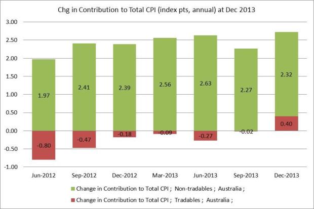
Looking at the contribution of both categories to the total CPI (annual), it does appear that there has been a shift in the source of price increases.

The contribution data is supplied by the ABS, and the addition of index points (not the index numbers) for both tradable and non-tradable categories sum to the All Groups CPI. The annual change in index points is calculated by subtracting Dec ’13 data from Dec ’12 data.

There aren’t enough qtrs of ‘contribution’ data to establish a long-term trend, but in the short term, there has been a shift in the annual change in contribution. This latest annual change has been the largest and it’s been the first time in a while where the tradable category added to CPI growth (+0.4pts) rather than offset growth in non-tradable categories.

Source: ABS

From an annual perspective, this may be an important shift.

Looking further into each of the categories shows the extent of the shift in the source of pricing pressure. It’s worthwhile reviewing the results of the same analysis for the CPI back in the June 2013 qtr to appreciate the extent of the shift.

Tradable Categories (items whose prices are largely determined on the world market (approx. 40% of CPI by weight), mostly imports)

Source: ABS 

Back in the June qtr, there were 24 tradable categories that had a negative contribution to the CPI (they offset price increases) – that has now reduced to 14 categories (and with lower values). On the flipside, the number of categories adding to CPI growth has increased from 10 to 15 categories. This change in breadth is a subtle shift that has happened behind the scenes, but is reflected in the growth of the trimmed mean and weighted median.

It’s likely that the depreciation in the AUD during this time has contributed to this shift. Categories such as international (and domestic) holiday travel were both larger contributors to CPI growth, mainly in the last two qtrs. The contribution of auto fuel jumped in the Sept qtr. Categories such as motor vehicles and audio visual continue to offset price increases, but to a lesser degree than in the past.

On the other hand, the picture for the non-tradable items looks much the same as it did in the June qtr. There are very few categories that offset growth – most non-tradable categories contributed to CPI growth – 33 out of 40 non-tradable categories.

Source: ABS 

The majority of the price growth still comes from the top few categories. The top six non-tradable categories contribute 53% of the increase. These are purchase of new dwellings by owner occupiers, rents, medical and hospital, domestic holiday travel and accommodation, electricity and property rates and charges. These six (6) categories also represent 41% of the weight of the non-tradable index, so would have a fairly broad impact on households.

Given that the non-tradable category is mostly service based and domestically focused, price growth in this category is sometimes thought to represent growth in labour costs. Whilst Australia does have relatively higher unit labour cost, current wage growth is at a low (wages growing, but at one of the slowest rates). The some of the main categories driving the non-tradable growth higher are not really labour intensive eg new dwelling purchases of owner occupiers, rents and electricity. Lower interest rates are more likely to be the driver of growth in the housing component in this group.

So what are the implications of this CPI report?

  1. RBA and interest rates – a worrying feature of the economy is the continued, albeit modest, rise in unemployment and underemployment. Lower interest rates have helped to spur housing, but not non-mining investment. With the dollar only just approaching its “magic spot”, it’s unlikely that the RBA will raise rates at this time. The challenge for the RBA will be to balance low interest rates and CPI growth. At the moment, the scales are tipped in favour of supporting demand through maintaining low interest rates.
  2. Real interest rates based on the official cash rate, are now negative. As CPI grows, it will eat further into the returns of savers and those on fixed income. This may act as prompt to seek out higher risk sources of income/return. For a current account deficit country, the worst case scenario is that if CPI does continue to grow, interest rates may have to rise in order to attract capital.
  3. The question remains over the ultimate success of interest rates to stimulate non-mining capex and investment. So far, the only lending that has been substantially impacted is housing finance (mostly swapping established dwellings for higher and higher prices), which has not grown the productive capacity of the economy, nor has it improved the labour market.
  4. Currency depreciation will have positive and negative impacts on the economy. Whilst it will help exporters and those locally competing with cheaper imports, it will likely increase the cost of inputs into production – the PPI will highlight the extent of this change. We are starting to see the impact of higher prices in tradable categories in the CPI, but at the same time, our manufacturing industry continues to contract. A comparison of unit labour costs among our leading trade partners (excl China) highlights the relatively higher labour costs in Australia (we are one of the highest). A lower dollar is aimed at offsetting that relatively higher cost. Ultimately the RBA may be required to perform some magic in order to keep the AUD in its ideal US$0.80 to $0.85 range. As central banks in emerging markets are finding out, this is not something in their control.

Employment still weak in December 2013

Employment conditions in Australia have been weak throughout 2013 and the December result was no different. In fact conditions in the labour market continue to worsen. Much of the ‘action’ is hiding behind the headline unemployment rate and employment totals. In this post, I’ll look at the December data and what’s happening behind the scenes.

Summary of Employment in Australia (trend data)

Source: ABS 

The December data highlights the continued poor employment situation. For the month there was a decline of 8.6k FT employed persons and an increase of 8k PT employed persons, resulting in a virtually unchanged total number of employed persons.

The total number of unemployed persons ticked up in December by 1.4k persons. I’m using trend data here for all my analysis to avoid the large fluctuations in the seasonally adjusted data. But the direction is the same no matter which data type you use.

As a result, the labour force was only slightly changed this month (+800 persons) which resulted in a slight uptick in the unemployment rate (from 5.78% to 5.80%). Whilst that’s not a robust employment report, it’s not a complete collapse either, right?

But the unemployment rate is not indicative of what is really going on behind the scenes in the Australian labour market.

Firstly, total employment growth remains well below trend.

Over the full year (Dec ’13 v Dec ’12), total employed persons grew by a mere 0.4% or +45k persons. This is sitting well below the ten (10) year average growth of +215k persons.

Source: ABS 

Growth in total employed persons is not keeping pace with population growth (the underlying population growth added to the Labour Force).

Source: ABS & The Macroeconomic Project 

Since August 2011 (the most recent point where the red line dips below the blue line, above), average population growth added to the labour force is just over 200k (each month v same month prior year). The average annual growth in total employed persons is 125k over that same period (and declines to only +45k growth as of Dec 13 v Dec 12) – and this is made up of FT and PT employed persons. The difference between the two lines represents persons either counted as unemployed, or persons who have left the labour force. I’ll come back to this later. But for the moment, the gap between population growth and employment growth is widening – and not in a good way.

Secondly, the (low) employment growth over the last year has been due to part time employment.

Over the last year, the composition of employment growth has deteriorated significantly. In December 2012, total employed persons grew by +160k persons, made up of growth of 104k FT and 56k PT employed persons. Even that growth was still well below the 10 year average growth rate. As of December 2013 that situation has worsened – FT employed persons declined by -62k persons, but, thankfully, PT employed persons grew by +108k persons, bringing the total up to +45k growth in total employed workers. From an income and spending perspective, this will likely dampen economic growth.

The current direction of the trend remains a worrying feature, especially when you break down total employment growth into its FT and PT components;-

Source: ABS 

The decline in FT employed persons is accelerating. This trend has been place since November 2012 – thirteen months. The trend in PT employment appears to have turned in the last two months as well – and it may be a little too early to call that. Part-time employment is still growing, but since October 2013, that rate has started to slow somewhat.

This situation is best demonstrated by looking at the state by state growth in total employed persons;-

Source: ABS 

Despite powering house prices, growth in ‘total employed persons’ in NSW is negative on both an annual and six month basis (becoming worse). The numbers in the chart above don’t do the situation justice. In NSW, FT employed persons declined by -51k while PT employed persons grew by 45k over the year (with a total of -5.8k annual decline in total employed). Over the last six months the situation has deteriorated much further with -55k FT employed persons and only +17k growth in PT employed persons. Yet the NSW real estate market powers higher. Go figure.

States such as VIC show a worsening employment situation as well, due mostly to low FT growth and declining PT jobs growth.

Although the QLD result looks strong, the growth is mostly all in PT jobs, with -3.6k FT jobs and +38.8k PT jobs growth over the last year. This situation is almost identical in WA with -2.2k FT employed persons and +17k growth in PT employed persons over the last year (Dec ’13 v Dec ’12).

The ‘total employed persons’ data does not show the underlying shift that has been taking place between FT and PT employment in Australia. The share of PT employment in Australia has continued to grow and it reached a new high in December 2013. Over 30% of those employed are now PT employed.

Source: ABS 

Thirdly, the growth in the total number of unemployed persons now exceeds the growth in total employed persons.

Over the year Dec ’13 v Dec ’12, the total number of unemployed persons has grown by +56k persons versus +45k growth in total employed persons. The total number of unemployed persons now exceeds the levels reached during the GFC. In reality, the total number of unemployed persons remained at reasonably elevated levels post GFC, really only “recovering” until early 2011. Since then, the total number of unemployed persons has continued to grow.

Source: ABS 

Note that the rate of growth (red line) in the total number of unemployed persons has been slowing down since May 2013. Does this mean that unemployment, and the economy, will start to turn a corner soon? The curious thing about the current labour market is that growth in total employed persons (FT plus PT growth) is slowing down (worsening). At the same time, growth in unemployed persons is slowing down as well (declining, but at a slower rate). It seems counterintuitive that slowing growth in employed persons isn’t showing up as increasing growth in unemployed persons. Over the last year, the unemployment rate has “only” ticked up by 0.4%pts from 5.4% to 5.8%.

Finally, the decline in the Labour Force Participation Rate (LFPR) is hiding structural, and possibly cyclical, changes in the labour market.

The LFPR has been declining from its peak of 65.8% since Dec 2010.

Source: ABS 

Earlier, we saw that the gap between the population component of the labour force growth and the growth in total employed persons was becoming wider. As at Dec 2013, the difference between the growth in labour force due to underlying population growth and total employed persons was 169k persons. This group are either counted as ‘unemployed’ or are counted as leaving the labour force. Both events are happening. The growth in total unemployed persons over the same time was +56k persons. The remaining 112k persons represent the decline in the LFPR. Another way to calculate that is by multiplying the difference (decline) in the participation rate between Dec ’13 and Dec ’12 (from 65.2% to 64.7%) by the working age population for Dec ’13. You get the same answer.

You can use this approach to look at what the unemployment rate would have been if the participation rate hadn’t declined. If the participation rate in Dec ’13 was the same as Dec ’12, and given the current level of employment growth, the unemployment rate could be as high as 6.7% (rather than the actual 5.8%). You only get this answer if you add the entire decline in the LFPR (112.6k persons) to the current total number of unemployed persons (716k) and express that as a % of the larger labour force size. There are a number of reasons why people are leaving the labour force. To characterize them all as ‘discouraged’ workers is potentially missing the structural changes that are impacting the LFPR i.e. retiring baby boomers. I’ll go into this in more detail in another post.

Using the unemployment rate as a gauge of the performance of the labour market doesn’t highlight the very large issues facing the economy. As FT jobs are swapped for PT jobs, there is an impact on income, spending and taxation revenue. This is likely to exacerbate the already challenging business conditions. More unemployed persons and less people in the workforce will also impact income, spending and government revenue and spending – especially at a time when the government is trying to cut spending in order to cut the budget deficit. More structural, demographic change to the labour force will impact the taxation and spending base of the budget going forward.

Aussie House Prices and Housing Finance – October 2013

The last time I reviewed the housing market was in February 2013. We were about five (5) rate cuts into this current cycle of eight (8) and house prices had started growing again. Back in February, the growth in housing finance debt was easily narrowed down to housing investors. What’s different now is that it’s no longer just investors driving the growth in housing finance. During 2013 and especially in the latest quarter to October 2013, owner occupier growth has also accelerated. House prices are now growing at 7.6% P/A and housing finance is growing at over 15% P/A.

The aim of this post is to bring together a range of credit and house price data releases from the last few months to get a view on the Australian housing market. I won’t keep you in suspense – based on housing finance data, there is no reason to think that the trend in prices is anything but up in the short-term. Given the historical lags between peaks in housing finance and house prices, it’s also possible that we’ll see house prices grow for much of 2014 across most states.

What’s behind the current growth in housing finance and house prices?

The red arrow in the chart below represents the start of this series of eight (8) interest rate cuts (Nov 2011). The green arrow represents the last housing finance trough (Mar 2011). So yes, housing finance did start to grow prior to the interest rate cuts, likely on the back of speculation of rate cuts to come.

I don’t have any evidence to suggest that there is a causal relationship between interest rate changes and house prices. But there is a reasonably strong correlation between interest rates and house prices (R=-0.75) over the last 30 months (since the interest rate cuts). This is slightly stronger than the correlation over the last 328 months (R=-0.60).

Since that update, house prices have continued to grow, but for the moment are still below recent peaks in the rate of growth;-

Source: ABS 

A review of current house prices

There are a number of different sources for house prices and all differ in what they measure. Below is a summary of the three (3) major sources of house price data in Australia.

Australian Bureau of Stats (data as at September 2013)
The ABS measures house prices of established detached dwellings – but not units or apartments, so it’s not a complete picture of all dwelling prices.

There are two ways I’d like to look at these house prices, firstly, by looking at the annual growth in prices of established detached dwellings.

Based on the latest September 2013 data, annual growth highlights that only Sydney and Perth house prices are growing above the National average. But markets such as Melbourne, Darwin and Brisbane (to a lesser extent) are not too far behind.

Source: ABS 

The picture changes somewhat when you look at the price index at September 2013 compared to the price peak in 2010 and adjusted for CPI. In this case, real house prices at a National level are still below December 2010 peaks by -5.3%.

Source: ABS 

On a state by state basis, in real terms, only Sydney and Darwin house prices have reached new highs (exceeded the highs from 2010);-

Source: ABS 

Most other markets are still well below their respective peaks of 2010 in real terms. In nominal terms, it’s a similar picture. Only Sydney, Perth and Darwin have exceeded 2010 highs. This has been a strong enough result to take the nominal National average higher than its 2010 peak as well.

No matter which way you cut the data, Sydney, Perth & Darwin have been the best performing markets in terms of house prices.

As I mentioned, the ABS only measures prices of established detached dwellings (not units), so I’ll also reference two other major providers to help fill in the gaps.

RP Data (year to December 2013)
RP Data (www.rpdata.com) tracks both unit and detached dwelling prices in each market. Note this is the latest data for December 2013.

The data from RP mirrors the story of the ABS – Sydney and Perth are growing faster than the National average (14.5% and 10% respectively, year on year to December 2013, all dwellings). Growth in Melbourne dwelling prices are not far behind (+8.5%). In this case though, Darwin dwelling price growth is lagging behind the market with +3.3% growth over the last year, with Unit price growth declining year on year by 3.8%.

According to RP Data, growth in the prices for Units has been catching up with House prices over the last year – the 5 capital city aggregate +10% for Houses and +8.9% for Units.

The latest month on month growth data is lower in all markets except in Hobart. The lower monthly rates of growth may not be surprising for this time of year i.e. less activity over the Christmas/NY period (the real test is whether there is a sustained decline in housing finance data in the new year). According to RP, all dwellings prices grew by 1.3% (National) for the month of Dec (versus month prior). Despite house prices growing at 14.5% year on year in Sydney, the month on month growth slowed to +0.74% in Dec.

Australian Property Monitors (APM) at September Qtr 2013
The data provided by APM is also broadly in line with ABS & RP data.

According to APM, house prices grew by +7.8% year on year. This reflects growth in all markets, but with Sydney, Perth and Darwin all leading the way (11.7%, 8.6% and 8.1% growth respectively). Even Hobart recorded strong growth of +5.7%. While still below the National average, growth in Hobart is well ahead of Adelaide, Brisbane & Canberra house price growth.

The quarterly data points to slow-down in house price growth across all markets. The most surprising is the slow-down in Perth house price growth – from +8.6% year on year to 0% growth (quarter).

Growth in unit prices was mixed. The year on year growth at September 2013 was strong overall +5.5%. Sydney and Darwin led the way (+10% and +8% respectively). Markets such as Melbourne, Brisbane and Adelaide were weaker – Brisbane recorded -4.6% decline year on year. On a quarterly basis, only Sydney and Darwin recorded growth in unit prices – which was enough to generate a positive 1.2% growth at a National level. All other markets experienced a decline in unit prices.

There is a reasonably consistent story on house prices across all three sources of house price data. To recap;

  • Sydney has seen the highest rate of growth of dwelling prices of all markets. In real terms, it is only one of two markets to now exceed its 2010 high in house prices
  • Perth house prices continue to grow above the National rate, but this has slowed over a more recent time frame
  • Darwin annual house price growth at September (APM & ABS) was +8.1% and +6% respectively, but again, in the RP December data house price growth slows to 3.3%
  • Melbourne is a bit of a dark horse – prices are growing just below the National average, but are still high in relative terms across all data providers
  • The slower growth recorded by RP over December could be a reflection of seasonal slow-down

Housing Finance – what it says about the next moves in house prices
The month of October was a big month for housing finance, with growth accelerating in most segments;

Source: ABS 

Investment housing finance has been the main driver of growth in housing finance, growing at over 20% in annual terms and accelerating in the most recent qtr to +26%. Growth in investment housing finance represents over 58% of the total dollar growth in all dwellings finance for the year to October 2013, or $17.6b in growth. In contrast, total owner occupier housing finance grew by $12.8b (ex refi’s, annual).

Since the start of this latest round of interest rate cuts, investment housing finance has grown from 41% share of all dwellings finance to 45% share.

Owner occupier activity hasn’t grown as fast, but it’s still growing at a high rate. The only exception is growth in owner occupier housing finance for new homes, which slowed over the recent quarter, but remains at a high level (+14%).

The increase in refinancing of established dwellings over the last quarter is notable. Activity has reached new highs for each month since May 2013. This is quite possibly due, in part, to lenders starting to raise their fixed interest rate mortgages. If borrowers think that rates are going up in the future, they may want to start to lock in lower rates. Alternatively, as house prices have grown, borrowers may be inclined to tap into some of that equity. Some may be restructuring to lower repayments (just to cover all options).

All Dwellings Finance (Total of Investment and Owner Occupier Housing Finance)
Growth in All Dwellings Finance (monthly growth v same month prior year) has reached pre-GFC highs of +20%;-

Source: ABS

Both investment and owner occupier housing finance is contributing to that growth – each segment in more detail later.

Importantly, All Dwellings Finance (ex refi’s) in dollar value reached an all-time high in the latest month of October 2013 exceeding the previous peak of June 2007.

Source: ABS 

Investment Housing Finance
Investment housing finance growth continues to accelerate and it too has reached its pre-GFC peak in growth (+28%);-

Source: ABS

In October, the value of investment housing finance reached an all-time high of over $10b in one month – which was an 8% increase over the month prior (which was also a new high). From the chart below, it looks like investment housing finance has gone ‘parabolic’.

Source: ABS

Owner Occupier Housing Finance

The growth in owner occupier housing finance hasn’t been as strong as investor housing finance, but annual growth is still very high and approaching pre-GFC levels. Growth for the latest month versus same month last year is +16%.

Source: ABS

In dollar value terms, the month of October is only 9% below the all-time high reached in September 2009, which was fuelled by a doubling of First Home Buyer grant.

Source: ABS

The largest part of owner occupier housing finance is the purchase of established dwellings, which has been the main contributor to the growth of owner occupier activity (accounts for $8.9b of the $12.8b growth owner occupier finance growth).

Owner occupier finance for new homes and construction both contributed to growth (+$3.8b) but growth in finance for new homes is slowing (red line), while construction finance for owner occupiers has lifted in recent periods (blue line):-

Source: ABS

The growth in the volume of owner occupier housing finance commitments was starting to slow during August and September, but has continued to bounce back in October. This chart highlights that whilst growth is on par with pre-GFC growth, the total number of owner occupier housing finance commitments is still well below its peak;-

Source: ABS

The slower growth of the last 3 months could be viewed as slightly bearish news. If any metric was going to turn first, it would most likely be volume (as prices rise, more people may become priced out of the market, yet total value growth could ‘mask’ any change in underlying demand) – and we saw this dynamic play out in 2006/07. Volume growth is still high and we’ll have to keep watching this metric to see if/when it changes.

State by State Overview – Investors and Owner Occupiers
On a state by state basis, there are a couple of key markets that are leading the growth in housing finance.

Source: ABS

As we saw earlier, investment housing finance accounts for the majority of the dollar value growth over the last year. Most of the growth in investment housing finance is coming from one state – NSW.

The growth in owner occupier financing is a little more evenly spread across the larger states, but WA still accounts for the largest share of that growth.

Owner Occupier activity by state
There are a couple of interesting points about the state by state owner occupier finance data. Note that the slight difference in the National growth rate is due to using ‘original’ not seasonally adjusted data – seasonally adjusted data is not avail on state by state basis.

Source: ABS

Across most of the bigger states, there has been a marked acceleration in the growth of the value of owner occupier finance over the October quarter (versus same qtr LY) – in NSW, VIC, QLD, even SA and TAS.

WA has generated the largest annual growth in dollar value (+$4b growth or 30% of the annual growth), yet the state only accounts for 15% of total Owner Occupier housing finance ex refi’s Nationally. But it’s one of three states that saw growth slow somewhat in the last quarter, albeit from/to very high levels. I’ve written about some interesting real estate indicators from key WA mining towns in another post. It appears some steam is possibly coming out of the WA mining markets, so it will be interesting to see how this develops in 2014 and what it means for the broader WA market.

The other notable slow-down in owner occupier housing finance was in NT.

Volume (actual number of commitments) is also growing in line with value growth at a National level, but with a few state differences. That said, over the most recent few months, the growth trend in the number of commitments appears to slow in WA, QLD, SA, NT and ACT. Again, there could be seasonal factors at work (clearance rates slowed at the same time).

Owner Occupiers – First Home Buyer’s (FHB) v Non-FHB’s
Owner occupiers can be broken down into two segments – First Home Buyers (FHB) and non- FHB’s. There are quite a few states where FHB activity has declined over the last year – NSW being the most notable.

Source: ABS

In NSW, the growth in non-FHB housing finance was almost completely offset by the decline in FHB activity, resulting in much lower overall growth (2% in NSW versus 6% for the National average). The trend in NSW is striking – since early 2013, the growth in non-FHB commitments appears to accelerate, whilst the number of FHB commitments halved over the last year.

Source: ABS

There has been much talk about how FHB’s are increasingly priced out of the market, especially in Sydney. The average loan size for FHB’s in NSW has reached all-time highs over the last 6 months and is currently at its third highest point.

In other markets;

  • FHB activity in QLD has almost halved over the last year
  • In WA, SA and TAS, FHB activity has grown at 22%, 23% and 17% respectively – likely in response to changes in first home owner grant schemes over the last year.

Here is a snap-shot of the various state-based FHB grant schemes;-

State Activity
NSW
  • FHOG* – New Homes – $15,000 for new home or to build own home (will reduce to $10k in 2016)
  • Exemption of transfer duty on new homes (valued up to $550k)
  • New Home grant scheme $5,000 for purchase of new homes, homes off the plan or vacant land
VIC
  • FHOG New Homes up to $10,000 (limited to $750,000 value)
  • Stamp duty reductions – new & established homes
QLD
  • Great Start Grant – $15,000 to buy or build a new home
SA
  • FHOG – New Homes (from 15/10/12) $15,000
  • Housing construction grant (15/10/12 – 31/12/13) $8,500
  • Off-the-plan-concession (stamp duty) – Purchase of off-the-plan-apartment $21,330
  • FHOG – Established homes (22/11/12 – 30/06/14) $5,000
WA
  • FHOG – New Homes – $10,000 (increased since 25/09/13)
  • FHOG – Established homes $3,000
TAS
  • FHOG – $7,000
  • FHOG – Buy or Build a new home $23,000
  • First Home Builder Boost – $7,000
ACT
  • FHOG – New & substantially renovated properties $12,500 (after 01/09/13)
NT
  • FHOG – established home in an urban area $12,000
  • FHOG – new/construction $25,000
  • Value of property capped at $600,000

*FHOG – First Home Owners Grant

Some state grants schemes have been more successful than others (based on the growth of FHB commitments). Despite the focus on new home first home buyer incentives, its interesting that growth in housing finance for new homes is slowing down (from the summary chart on housing finance) from +28% to +14% growth. This is being driven by slowing growth in NSW, VIC, QLD, ACT and most notably in WA and NT. In WA, owner occupier finance for new homes has gone from +30% annual growth to -10% decline in the latest quarter. Note from the table above that the incentives for the purchase of new homes in WA (for FHB’s) were just increased in September (as well as in ACT).

Investment housing by state
Lending growth for investment housing has accelerated in the latest quarter across most states, with the exception of WA and ACT.

Source: ABS

Whilst the WA figures aren’t significantly different between the annual and quarterly growth rate, it is consistent with a similar slow-down in owner occupier finance growth experienced in that state.

In the ACT, investment housing finance reached an all-time high in June 2013 and has drifted off ever since and is now below the 12mth moving average.

Some other notable points on investment housing finance;

  • NSW reached an all-time high in the latest month (October 2013)
  • Victoria and NT exceeded its all-time high in the latest month as well (previous was May 2010)
  • QLD, SA and TAS are still well off from their all-time highs (and well below the National average), but are trending up nonetheless

Where to next? What the relationship between housing finance and house prices tells us…
There is a strong correlation between house prices and all dwellings finance ex refi’s (R=0.963, a correlation of 1.0 is a perfect positive correlation).

Source: ABS

Looking further at the relationship between housing finance and house prices highlights that there is a lag between changes in housing finance and house prices. Using ABS house price data and All Dwellings Finance data (ex refi’s) there is on average a nine (9) month lag between a peak in housing finance and any decline/stall in house price growth. Although the average is 9 months, the range is between 6 and 12 months. This average is based on seven (7) periods where All Dwellings Finance and the ABS house price index declined since 1986.

Using this crude forecasting measure and given that All Dwellings Finance is currently on its highs, it’s possible that we will continue to see house price growth throughout most of 2014. I’ll be looking for a peak in housing finance and at least 3-4 months of sustained financing declines before I consider the possibility of house price declines (at a National average level).

That said, not every state is in the same situation. The markets where housing finance is on its highs:

  • NSW – both investor and owner occupier housing finance $ value is on its highs (has reached all-time highs)
  • VIC – investor housing finance leads the way and owner occupier housing finance is very close to its highs. The total of both reached an all-time high in October 2013
  • QLD – both investor and owner occupier housing finance $ value has reached an intermediate high (but are well off the all-time highs – this point doesn’t matter for relative house price growth)
  • TAS – the total of investor and owner occupier housing finance has started to recover (mostly driven by owner occupier housing finance), reaching an intermediate high in October 2013 (last seen in Mar 2010)
  • NT – investor housing finance is on its highs and this is helping to drive total housing finance near all-time highs

Until there is any evidence of sustained decline from these intermediate or all-time peaks in housing finance, house prices are likely to grow for most of 2014 in these markets.

It’s less clear in SA and WA. All dwellings finance in both of these markets is off its high, but still elevated. Both markets peaked in May 2013 and are now -4% and -8% respectively below that peak as of October 2013. If housing finance continues to decline from the May 2013 peak in these two markets, then house price growth may continue for (approx.) the next 4 months before it either stalls or starts to decline (depending on the size of the change in finance).

In ACT, housing finance is approx. 15% below its peak reached in May 2013. House prices in this market will likely come under pressure in 2014 as long as this trend continues. The latest quarterly data from the ABS has ACT house prices at -1.2%, although the more recent RP Data has Canberra house prices still growing at 3.3% (annual) as at the end of Dec 2013.