Terms of Trade

Further deceleration in the Australian credit impulse – Feb 2017

The latest RBA credit and lending aggregates for Feb 2017 show that the growth in new credit has continued to decelerate.

Total Private Credit – growth in new credit decelerates further in Feb to -$24b

The growth in new credit at the aggregate level (total private sector) began to decelerate sharply from April 2016. Since then, the annual growth in new credit has gone from +$30b in April 2016 to -$24b as of the latest February 2017 data. This is now approaching the lows reached in mid-2013:-

Source: RBA, The Macroeconomic Project

The main driver of this slowing growth in new credit has been business credit, which has continued to slow since June 2016. The growth in new credit for mortgages started to accelerate in November 2016, but this has not been large enough to offset the deceleration in business credit growth.

Progressively smaller increments in the growth in new credit are likely to result in lower spending and growth. Consider that the annual growth in the stock of total private credit in February 2016 was $161.9b and this annual growth in credit slowed to $137.9b in February 2017 – overall, this is -$24b less annual credit growth in the economy. This equates to approx. -1.4% of nominal GDP.

Given the recent strength in economic growth data (which is so far only the Dec ’16 quarter), the question is whether other sources of spending growth, such as income, are accelerating to offset this deceleration in total private credit growth.

Read more on the Australian Debt and Credit Impulse page of this blog.

Declining consumer prices – March qtr 2016

Last week, the ABS released the March 2016 quarter CPI data. This was attention grabbing stuff with headline CPI falling -0.2% in March. Suddenly, we were in the grip of deflation and many news outlets were quick to latch onto this story. I’m the last person to joke about deflation. Asset price deflation is a very serious threat to our country because we are so highly leveraged and our financial system is ‘all-in’ on housing. I’m also less positive than most about economic growth and recent developments in the labour market. But not much time was spent looking through the CPI data before jumping straight to the “deflationary” headlines last week.

The deterioration in CPI growth between the last two quarters from +0.4% in the Dec quarter to -0.2% in the Mar quarter can be attributed to categories that have more external/international exposure, rather than categories that are more of a reflection of domestic conditions.

That doesn’t mean that domestic factors haven’t played a role in the slowing of CPI growth over a longer period of time. The economy has been growing at below trend/potential as it transitions from the peaks of the mining investment boom and especially since the terms of trade (ToT) started to unwind. This has been highlighted by the RBA for several years now and policy settings have been focused on supporting demand during this transition. But is this CPI print a reflection of how demand in the economy has deteriorated in the latest quarter?

Headline versus core CPI measures

The RBA does not tend to rely on the headline CPI figure in evaluating consumer price pressures for interest rate policy. The focus is more on measures of core inflation – the weighted median and the trimmed mean. Both of these remove the volatile items to provide a measure of underlying strength in consumer prices within the economy.

Annual growth in the trimmed mean has slowed to its lowest level and quarterly growth was +0.2% in March. Annual growth in the weighted median also slowed to its lowest level of growth of +1.4% and +0.1% for the quarter. Both measures are outside of the 2-3% average inflation rate.

Source: ABS

Both of these measures have been trending lower for a while and the RBA has tended to ‘look through’ this slowing of consumer price growth. Throughout 2015, there were signs of improvements in the Australian labour market, despite lower wage growth, moderate economic growth and a weakening AUD. From the April board meeting, the RBA assessment was for “reasonable prospects for continued growth in the economy, with inflation close to target” (RBA Minutes April 2016). That was four weeks ago.

Do we still have ‘reasonable prospects for growth’?

In short, when demand conditions are weak, inflationary pressures are likely to be less. In other words, softer price growth, or price declines, are another way of assessing the strength of demand in the economy. The question is whether this CPI decline is indicating a slowing in domestic demand conditions enough to warrant further interest rate cuts.

The tradable v non-tradable CPI series provides the most important insight on price pressure in the economy

An insightful way of assessing the source of consumer price pressures is to look at the tradable versus non-tradable series of the CPI. Consider the example of falling fuel prices throughout 2015. Fuel prices have fallen globally and aren’t necessarily an indicator of a fall in our own domestic demand – we are a price taker in such commodities.

I’ve referenced this RBA paper before and its worth revisiting here – The Determinants of Non-Tradables Inflation. There are several important points:-

“Non-tradable items are exposed to a low degree of international competition. This includes many services that can (in most cases) only be provided locally, such as hairdressing, medical treatment or electricity. The prices of these items should be driven mainly by domestic developments. Therefore, inflation for non-tradable items should provide a relatively good sense of the extent to which demand exceeds (or falls short) of supply in the domestic economy.”

“Tradable items are much more exposed to international competition. This includes many imported manufactured goods such as televisions and computers, as well as some food items and services such as international travel. The prices of these items should be less influenced by conditions in the Australian economy, and more affected by prices set on world markets and fluctuations in the exchange rate.”

And a word of caution about these classifications:

“The RBA acknowledges that in practice, drawing a precise distinction between a tradable and a non-tradable item is difficult. The exposure of an item to international competition is both complicated to measure and a matter of degree. The Australian Bureau of Statistics (ABS) classifies an item as tradable where the proportion of final imports or exports of that item exceeds a given threshold of the total domestic supply. Any item not meeting this definition is classified as a non-tradable. In general, many goods are classified as tradable while nearly all services are classified as non-tradable.”

Throughout the last several decades, annual non-tradable inflation has grown at a higher rate than tradable inflation in Australia:-


Source: ABS

Since mid-2013 though, non-tradable inflation has started to abate as the ToT has unwound and as income and wage growth has slowed.

When we break down the growth in tradables versus non-tradables to a quarterly basis, it becomes clear which area contributed to the much lower CPI print in the March quarter.

In the latest quarter, tradable CPI declined by -1.37%. That is a significant fall in just one quarter. On the other hand, non-tradable inflation increased by +0.45% in the quarter – but this is also still below the average for the last several years.


Source: ABS

The trend over the last 12 quarters highlights the volatility of the tradable series (this is also evident in the annual series).

We can go a bit deeper. In the latest quarter, the index of tradable categories contributed -0.55% pts to the -0.22% decline in headline CPI. The non-tradable categories contributed +0.33% pts to the -0.22% decline.

Source: ABS

Looking at CPI from this perspective suggests that it is less likely that the shift to a negative CPI in the March quarter came as a result of deterioration in demand, or events, within the domestic economy. It appears most of the ‘deflationary’ pressure came from those categories that are more exposed to international competition.

Where did the tradable deflation come from?

Tradables reversed from contributing +0.19% pts to CPI in the Dec quarter to detracting -0.55%pts to CPI in the March quarter. Many categories classified as tradable contributed to this reversal – there were twenty six (26) categories where the change in contribution slowed between the two quarters – that’s over half of the categories classed as ‘tradable’, so the slowdown in price growth was broad. The largest contributors to this reversal came from four (4) main categories:

  1. Tobacco price index in the Dec quarter contributed +0.26%pts to CPI growth. In the Mar quarter, price growth slowed and only contributed +0.03%pts. This was the single largest contributor to the -0.78%pt decline in tradable inflation between the two quarters. The tobacco federal excise tax biannual tax indexation came into effect 1st Feb 2016.
  2. Automotive fuel price index contributed -0.18%pts in the Dec quarter. This decline accelerated to -0.31%pts in the Mar quarter. Fuel prices look to have stabilized for now.
  3. Int’l travel accommodation price index contributed +0.6%pts to CPI growth in the Dec quarter. This reversed to detracting -0.5%pts to CPI growth in the Mar quarter.
  4. Fruit price index contributed -0.03%pts to CPI growth in the Dec quarter. This accelerated to -0.13%pts in the Mar quarter.

These top four categories were -0.57%pts of the -0.78%pt deterioration in price growth between the two quarters. There were 12 categories where price growth accelerated and 9 categories where there was no change in growth between the two quarters.

Non-tradable growth has been low in historical terms throughout 2015, but did pick up in the March 16 quarter. Nearly half of all categories classed as non-tradable recorded an acceleration in price growth in the latest quarter – this acceleration was broad based. The largest contributors were medical and hospital charges, secondary education, childcare, household fuels including gas and restaurant meals. There were ten non-tradable categories where price growth slowed between the two quarters, but there was only one large one – domestic holiday and travel, which went from adding +0.16%pts to CPI in Dec quarter to detracting -0.05%pts in the Mar quarter.

The notable slow down on the domestic inflation front has been from a slowing contribution from new dwellings and rents. This has been a function of slowing income/wages growth, a tightening of lending standards for housing to curb riskier lending by banks with regard to investor/interest-only mortgages and a general slow-down in housing demand, especially in key mining areas.

What is it saying about the economy?

The split between tradable and non-tradable inflation over the March and Dec quarters suggests that the decline in CPI was not led by the domestic economy. But growth in non-tradable inflation has been lower than average for a while and it is fair to say that this is a reflection of spare capacity in the economy.

The RBA has asserted that ‘transition’ (from mining) will be assisted by wage restraint, stimulatory interest rate policy and a lower dollar (“Managing Two Transitions”, Deputy Governor Philip Lowe 18 May 2015). Based on this, there are several important considerations for the RBA in assessing interest rate settings:-

Wage growth and the labour market – over the last 12 months, spare capacity in the labour force especially, has been reduced, as evidenced by an improved LFPR, a decline in the unemployment rate during 2015 and generally stable levels of GDP growth. Some of the lower wage pressure can be traced back to a rotation out of much higher paying mining-related jobs that may no longer exist into more average-wage jobs. From the last board minutes, the RBA expected a softening of labour market conditions, given the improvement throughout 2015. My last labour market update highlighted that momentum in the labour market is waning. Without accelerating employment growth, lower wage growth will place a brake on domestic spending and demand.

Housing and credit growth is likely to be an issue. A crack-down on lending standards, a focus on increasing bank capital buffers, and in some cases higher overseas funding costs, has led many lenders to raise mortgage rates and slow their investor mortgage lending – the opposite of stimulatory monetary policy. This is going to weigh on the RBA decision making. House price appreciation has been slowing and is falling in some markets. It’s another story altogether whether banks pass through any further rate cuts.

A lower AUD has been one of the key pillars to support the shift toward non-mining industries especially services exports. The strengthening in the AUD/USD since February could be cause for concern for the RBA. This has been partly driven by the US Federal Reserve putting the brakes on further US interest rate hikes. This has weakened the US dollar against most major currencies, but has also helped to stabilize global financial markets.

The minutes from the April meeting on monetary policy certainly opened the way for monetary policy to be “very accommodative”. The ultimate question is whether another rate cut is the stimulus that the economy needs to kick start growth again. Overall lower-than-average trend growth persists, not just in Australia, but globally. The RBA Governor asks whether we are ‘reconfiguring’ to this lower trend growth (“Observations on the Current Situation”, Glenn Stevens, 19 April 2016):

“That would help to explain why ultra-low interest rates are not, apparently, as successful in boosting growth in demand as might have been expected. The future income against which people would borrow looks lower than it did, not to mention that the current income against which some already had borrowed has turned out to be lower than assumed”

“If we could engender a reasonable sense that future income prospects are brighter, that there is a good return to innovation and ‘real economy’ risk taking, and so on, then people might use low-cost funding for more productive purposes than just bidding up the prices of existing assets”

In addressing the issue of lower trend growth, the RBA is also pointing to the need for more action on other policy fronts to support monetary policy.

“It is surely time that policies beyond central bank actions did more in this regard”

There may not be enough evidence just yet for another rate cut, but it’s likely to be a matter of time.

Transitioning well? Australian GDP & National Income – Dec 2015

At first glance, the data relating to the 4th quarter GDP was fairly straightforward. The Australian economy grew by +0.6% in the final quarter of 2015, better than the +0.4% growth expected, but well down on the previous quarter. The upward revision to the previous September quarter growth from +0.94% to +1.09% growth resulted in annual GDP growth upgraded to +2.96%. This bumped up annual GDP growth to just above average trend growth for the last 10 years. This got quite a few people excited and soon many had jumped back onto the bandwagon that the economy is transitioning well out of the mining boom. It’s always worth looking deeper into the drivers of growth and this quarter is no exception. Whilst this isn’t a bad result at all, there is still enough in the data to challenge the narrative that Australia is transitioning well.

December 2015 quarterly real GDP growth +0.63%

Despite being well down on the previous quarter, GDP growth for the December quarter was very much in line with the average for the last 10 years. This is clearly not a bad result looking at the quarterly results over the last 20 years.

Source: ABS

Of all the components that make up GDP, household consumption spending made the largest contribution to GDP growth on both an annual and quarterly basis.

Source: ABS

Household spending contributed over half of the growth for the year and two thirds of the growth for the quarter. It didn’t take long before this was labelled the ‘strength in the household sector’. I’ll come back to this point later.

Government consumption expenditure and net exports both made a strong positive contribution for the year, but barely contributed to growth in the latest quarter.

Private investment continued to go backwards for the year and the quarter, but government investment spending made a surprise and welcome positive contribution to growth in the latest quarter.

Inventories made a positive contribution in both the quarter and the year. Inventories represent work in progress, materials and finished goods etc. that are owned by the business, whether they are held at the business premises or elsewhere and are recorded at book value at the end of the quarter. It’s difficult to pinpoint what this means – either inventories were ramped up on higher demand expectations or lower than expected sales resulted in increased inventories. The higher contribution is the result of the ‘change in inventories’ going from negative in the previous quarter to positive in the latest quarter.

But real National Income keeps falling

Real GDP growth is a measure of the growth in the underlying output of the economy. But National Income is a better measure of the income derived from/generated by that output. The ABS recommends Real Net National Disposable Income (RNNDI) as the best measure of changes in our “economic wellbeing”. This measure “adjusts the volume measure of GDP for the terms of trade effect, real net incomes from overseas and consumption of fixed capital” (source: ABS). Using this measure, National Income continued its recent decline, falling another -1.1% for the year and -0.1% for the quarter. A big driver of this decline was the latest 12% fall in our terms of trade (ToT).

The real NNDI measure isn’t broken down into its component parts so that we can understand where/what part of National Income is driving this decline. There are several elements that make up the National Income figure – employee compensation, the gross operating surplus (corporate profit proxy) and gross mixed income (surplus/deficit from the operations of smaller unincorporated enterprises). In order to go to this more detailed level, I need to revert to Gross National Income (GNI) in current prices (nominal). In real terms national income is falling. But in nominal terms, gross national income is growing at +2.6%.

I’ve used the chart below before because it provides perspective on how much our National Income growth has slowed over the last five (5) years.

Each bar represents the annual growth in Gross National Income and shows how each component has contributed to growth in that year. Whilst National Income growth, and the contribution from its component parts, is not on its lows, it hasn’t accelerated higher in the latest year either (and we know that in real terms, National Income is declining).


Source: ABS 5206.11

The annual rate of growth in GNI has remained fairly stable over the last two quarters. But a different picture emerges when you look at the quarter on quarter growth rates.

The latest quarter National Income growth is slowing

The December quarter growth was in fact slower than in the previous quarter. The chart below looks at the same National Income components, but using the quarter on quarter growth for the last eight (8) quarters:-

Source: ABS

There are two important points I want to make about the December quarter results.

Firstly, there was a larger contribution from ‘Gross Operating Surplus’ (GOS) in the December quarter (orange bars in the chart above).

This needs to be broken down further because it doesn’t tell us much in aggregate. The GOS is the sum of private, public and financial corporation surplus (a profit proxy), general government surplus and the surplus generated by dwellings owned by persons. Here is how each of those components has contributed to growth over the last eight (8) quarters:

Source: ABS 5206.07 – the sum of these components represent the “GOS” component of National Income.

The contribution from General Government and Dwellings is fairly consistent. Business profitability, on the other hand, tells us something important about the trading environment.

According to the National Accounts, in the chart above, private non-financial corporations have made the largest contribution to growth only in the last two quarters (light blue bars), which is a large turnaround in performance compared to the prior six (6) quarters. This is the single largest component of the GOS and is probably the most important to look at in relation to underlying business conditions. We know that Mining has a large influence on the outcome of this measure. The ‘Mining’ industry accounts for a substantial 26% of corporate profits (Source: 5675.11) – no other industry group comes close to this.

According to the data in 5675.11 Business Indicators, the performance of Mining in the Sept quarter (versus the June quarter) was actually positive and which made a large contribution to the positive shift in corporate profits. But according to the same data source, Mining profits fell again in the December quarter. That would then mean that Non-Mining business profits would have had to have accelerated in the December quarter in order for total private non-financial corporations to continue to make a positive contribution overall (again I’m referring to the December quarter light blue bar in the chart above). This would be an important insight about the performance and transitioning of the economy. So did non-mining profits accelerate?

We can only get down to industry-level data by looking at Company Gross Operating Profits released by the ABS as a part of Business Indicators (5676.11) data release. You can also use 5676.15 – the direction of the data is the same between the two data sources. According to the ABS:

“Company gross operating profits data are used to compile estimates of gross operating surplus of private non-financial corporations” (Source: ABS Business Indicators)

The two measures of company profit aren’t identical, but are very similar. Comparing the results of the two measure over time, there are consistently differences in the rate of growth between the two measures, but rarely do they point in opposite directions/conflict. Except for this quarter.

Breaking down the result by industry in 5676.11 yields a very different result to that of the National Income figures.

At a total industry level, Company Gross Operating Profits declined by -2.8% in the December quarter versus the National Income figures which shows that the Gross Operating Surplus of Private non-financial corporations grew by +0.9%.

According to the data in 5676.11, the decline in Company Gross Operating Profits was driven by both Mining and Non-Mining industries in the latest quarter:-

Source: ABS 5676.11

The only quarter where Mining profits were positive was in the Sept 15 quarter, which is consistent with the stronger results in the Sept quarter.

Non-Mining is the big news here – corporate profit growth has deteriorated in the last two quarters, so much so that Non-Mining Company Gross Operating Profits declined in the December quarter. So if both Mining & Non-Mining profits declined in the latest quarter according to the Business Indicators data (5676.11), then how can the similar measure of “Private Non-Financial Corporations GOS” from 5206.07) make a larger positive contribution to National Income growth in the latest quarter?

From the ABS website (Business Indicators 5676 page):-

COMPARISON BETWEEN COMPANY GROSS OPERATING PROFITS AND GROSS OPERATING SURPLUS

Valuation changes have had an impact on the value of inventories held by Australian businesses this quarter. An inventories valuation adjustment (IVA) is applied in the calculation of the gross operating surplus of private non-financial corporations (GOS) estimate in the Australian National Accounts. The IVA for the December quarter 2015 is -$1,369m which is $1,974m lower than the September quarter 2015 IVA of $605m.

No adjustment is made to the company gross operating profits (CGOP) estimate in this publication and, as a result, users should exercise caution when comparing CGOP and GOS (my emphasis). It should be noted that there are other differences between the two series. In particular, changes are made to GOS when annual benchmarks are applied and slightly different seasonal factors apply to the two series. Given this, while CGOP movements are an appropriate indicator for GOS, the two series will not have equivalent seasonally adjusted movements from quarter to quarter. (Source: ABS – Business Indicators Dec 2015)

So comparison between the two measures is problematic. If no adjustment has been made to the CGOP in Business Indicators, then did the application of a lower inventory valuation actually increase the GOS in the National Accounts in the latest quarter? Could differences in seasonal adjustment account for all of the difference? Which indicator is then the more accurate representation of underlying business profit performance? As mentioned, non-mining industry performance is an important indicator for how the economy is really transitioning.

At best there is a question over the real direction of profit growth at an industry level. I have put this to the ABS for clarification.

The second point relates to the slow-down in growth of Compensation of Employees.

Employee compensation is the largest proportion of National Income at 50% and provides some basic context for the scope of spending growth in the economy.

The accelerating growth in employee compensation since the December 14 quarter has been consistent with an improving labour market at the same time. Except in the latest quarter, when growth in compensation more than halved between the two quarters.

Source: ABS 5206.44

I’ve compared the growth in Sept (Sep v June) and Dec (Dec v Sep) by state (5206.44) in the chart below. Breaking the data down to state level gives some indication of performance differences between mining and non-mining states. It’s not a perfect proxy.

Only in WA and ACT did the growth in compensation of employees improve over the last two quarters. In WA, the best thing you can say is that employee compensation didn’t continue to fall.

Source: ABS 5206.44

Most of the slow down between the two quarters can be attributed to the private sector which accounted for two thirds of the slow down.

Private sector employee compensation growth slowed the most in NSW – again, the engine room of the so-called transition – from +2.5% to +1.1%. This is actually consistent with my previous labour market update highlighting that NSW labour market was no longer looking as strong as it had been.

VIC had the highest quarterly rate of employee compensation growth in December of all the states. Although growth has been slowing for two quarters now, it is still around the average:-

Source: ABS

The main problem state is QLD – the decline in private sector compensation of employees has been accelerating over the last two quarters – the first time since the GFC:-

Source: ABS 5206.44

This is unfortunately at odds with the previous labour market update, which showed employment growth in QLD still at its peak as of the end of 2015.

The situation is similar in South Australia – private sector employee compensation growth has slowed over the last three quarters and has now turned negative in the December quarter.

Growth in employee compensation in WA has been negative for the last four quarters, but in the latest quarter, it has stopped declining, which means it’s still on its lows. In TAS and NT growth in employee compensation also slowed to virtually zero in the latest qtr.

Only in ACT did the growth in compensation of employees accelerate higher in the latest quarter:-

Source: ABS

Across most of the larger states, growth in employee compensation looks like it is slowing, if not outright declining. I’m using the eastern seaboard states (especially NSW and VIC) as proxies to gauge the ‘transition’ from mining states to non-mining states. The original point was about highlighting the slowdown in employee compensation growth between the two quarters. Most of this slow down can be attributed to NSW, VIC & QLD, with NSW by far the biggest contributor to the slow down between the two quarters. It could be a one off for NSW as there is no established trend there at the moment, but this outcome is consistent with my previous labour market outlook for NSW. This puts a dent in the narrative that the economy is transitioning well.

But there is more.

This slowdown in the growth of employee compensation in the December 15 quarter came at a time when growth in hrs worked has been accelerating higher over the last 3 qtrs. The growth in hours worked in the latest quarter is the second highest since the GFC and growth accelerated from 0.4% in the September quarter to +1.17% in the December quarter.

Source: ABS

This has brought the annual rate of growth close to pre-GFC highs. Growth in hours worked has been accelerating since late 2012.

Source: ABS

Yet, output hasn’t grown along with hours worked. In fact, output per hour worked (labour productivity) has been slowing since late 2012 and has started declining.

Source: ABS

In the December quarter, labour productivity declined by -0.6% to bring the annual decline to -0.4%.

The concept of “unrequited input growth” was raised in a Productivity Commission report into falling Australian productivity (source: Productivity Commission Report, “Australia’s Productivity Growth Slump: Signs of Crisis, Adjustment or both?” April 2012):-

“And so, in proximate terms, the decline in MFP [multi factor productivity] growth was associated with ‘unrequited input growth’ — strong acceleration in input demand that was not matched (or stimulated) by an acceleration in output growth. This is the key to understanding Australia’s much poorer productivity growth. Explanations must tell us why Australian businesses used a lot more inputs, without getting more growth in output ”

This was from a paper written in April 2012, so is not referencing this current labour productivity situation. The quote goes on to say that such a situation is not sustainable:

“The notion of unrequited input acceleration does raise the question of how such a phenomenon could be sustained. Typically, output growth provides the additional income needed to fund additional growth in inputs. Consequently, unrequited input growth does not make financial sense, unless there is another source of income growth. Chapter 2 also shows that profitability not only held up, but actually increased in the 2000s. The extra input accumulation was fuelled at least in part by increased profits and profit expectations. Clearly, productivity was not the source of growth in output and income that it was in the 1990s. Rather, the broad productivity trends of the 2000s seem to have been more the outcome of strong input growth driven by marked changes in prices and profits.”

In other words, the ‘returns’ were generated by increases in, and expected increases in, prices including commodity prices, rather than higher productivity generating greater profits.

We no longer enjoy those ToT benefits. Which brings me back to the idea of sustainability of input growth (increasing hours worked) without getting more output growth as a result. The annual growth in hours worked chart suggests that in recent times, when growth in hours worked has resulted in negative labour productivity, hours worked has started to fall. We are now at that stage of the cycle where labour productivity growth has turned negative and we’ll see whether this higher growth in hours can be sustained.

So far ‘rebalancing’ or transitioning has seen higher hours worked but no discernible increase in output growth, and in fact, if you use the Business Indicators data, declining company profits across mining and non-mining in the latest quarter. In the absence of price growth, this is not likely to be sustainable.

So how can Household consumption be the main driver of economic growth?

My final point on the December GDP result and the idea of the transitioning economy, relates to our single largest driver of economic growth at the moment – households.

The big news from GDP was the strength of household expenditure and its resilience in the face of our transitioning economy.

Whilst the contribution from households is large, the direction of spending growth has remained fairly steady over the last few years – not accelerating growth. The current annual rate of growth in real household consumption expenditure is now +2.9% (+4.6% in nominal terms). On a quarterly basis, growth pulled back only slightly from +0.9% in September to +0.8% in December.

Source: ABS

Compared to recent history, growth in household spending has been growing at a fairly consistent rate of just under 3% for the last 18 months.

This rate of growth is not great when you consider that the rate of household consumption growth has been much higher in previous years. But how could household spending be any higher? The context from National Income shows that employee compensation growth (and wages) has slowed considerably over the last five years and in some states, employee compensation has recently turned negative. This has translated into slowing growth in household gross disposable income as well.

Gross disposable household income growth has been slowing since it peaked in 2007 at +12% annual growth – growth is now running at +3.1%. Adjusted for CPI, gross disposable household income is only growing at 1.4% in real terms. This rate of growth is low and is slowing:-

Source: ABS

Maybe the real question is how household consumption expenditure growth has remained at this constant level while household income growth has been slowing?

One reason is due to falling net household saving. Note that the ‘net savings’ measure is actually a calculation of the difference between income and spending of households. As spending increases faster than income, net saving falls. This is what has been happening since the peak in net household saving since mid-2012. In the last year, net household saving has fallen 15%.

Source: ABS

This fall in net saving is partly funding the growth in household consumption.

The other important source funding household spending growth is household debt. While growth in household disposable income has been slowing and is now at a relatively low point, real mortgage debt as a % of real GDP has been rising to its highest point – accelerating in fact since mid-2014. The stock of outstanding housing debt now represents 85.5% of real GDP (total real private debt represents 140% of real GDP):-

Source: ABS, RBA

Compared to household disposable income, household debt now represents in excess of 175% of disposable income.

It seems we might be pinning our hopes on a transition based on continued spending by households that have been facing lower income growth and greater levels of indebtedness. Whilst the GDP top-line results look good, the underlying factors say that the success of the ‘transition’ is on shaky ground.

GDP top-line looks better than it really is – Sept 2015

The GDP result for the September quarter came in ‘better than expected’. In real terms, the economy grew by 0.9% in the Sept qtr and +2.5% for the year. This is historically low growth, but given the scope of the adjustment currently underway in the Australian economy, it’s not a bad result.

This is a case though where the ‘better than expected’ top-line result isn’t representative of the underlying performance. Our latest growth figures were mostly the result of an unusually high contribution from net exports in the quarter. Investment spending continues to fall and household consumption spending was at best, on par with previous results and not really trending either way. The less-worse National income figures were due to Terms of Trade that didn’t decline as much in the Sept quarter.

Indicators of domestic activity show that the economy is continuing to languish. One measure of domestic activity known as Gross National Expenditure or GNE (which is just adding up the contribution of all consumption spending, investment spending and inventories), shows that growth was negative in the latest quarter:-

Source: ABS

There are several important points about the September quarter results.

Net exports made an unusually high quarterly contribution to GDP growth

…and the question is whether this latest quarter of net export contribution can be sustained. The analysis below is based on chain volume measures ie removing price effects. The situation would look different if you looked at nominal results.

The size of net exports in the Sept quarter was unusually large and was the combination of two factors 1) larger-than-normal growth in exports and 2) a corresponding contraction in imports.

To provide some historical context – the contribution of net exports to real GDP growth in the Sept 2015 qtr (last orange bar) was the fourth largest quarterly contribution since the start of this data series:-

Source: ABS

The chart above suggests that these ‘blowout’ quarters are infrequent, but not impossible, events. Net exports have been making a larger contribution to GDP growth since 2010.

Exports – Of the $4b growth in exports for the quarter, $3.9b of that was due to growth in goods exports. The biggest contributors to growth in goods exports for the quarter were non-monetary gold ($2.36b), metal ores ($1.24b) and then coal ($0.9b), in real terms. So actually, the largest contributor to our export growth for the quarter had nothing to do with mining. The size of the Sept quarter export growth for non-monetary gold was unusually large. But all it represented was a return to a fairly normal level of exports – it was actually the previous quarter fall that looks like the anomaly.

While there has been a slow-down in growth of our largest export, metal ores & minerals, volumes are still at all-time highs. The current level of contribution to growth is actually above just above average. At the time of writing, iron ore spot prices have now fallen below US$40/mt. The ongoing fall in prices is likely to result in a shake-out among higher cost producers, but the impact on our export volumes will be dependent on how low prices fall and how much Chinese economic growth slows (our largest export market). By all accounts, growth in China is expected to slow in 2016 and this will likely have adverse effects on our exports.

Despite the higher growth in the latest quarter, annual growth in coal exports have been negative over the last two quarters.

A significantly smaller amount of our export growth, $140m, was attributed to growth in services exports in real terms (source: ABS 5302.06). Growth in service exports have slowed in the last two quarters. There is no doubt that the growth in services exports has benefitted from the falling AUD, but the size of the sector for the moment is still small – approx. 20% of overall exports (in real terms). There is still much work required to further develop our service export industries and the Productivity Commission released a draft paper in August 2015 “Barriers to Growth in Services Exports” outlining the barriers and potential remedies.

It’s likely that we will continue to see higher than average contribution from exports (in real terms) to GDP growth in the near term, maybe just not to the same degree as this quarter.

Imports – Imports contracted by over $2b in real terms for the quarter. This is now not an unusual event, but the recent trend is somewhat unprecedented in the history of the data.

Goods imports peaked in June 2012 and are now 2% below that peak. Service imports peaked later in June 2013 – and are now 16% below that peak.

Source: ABS

Most of the decline in services imports can likely be attributed to the falling AUD. Since Sept 2013, price deflators (price index) for service imports increased by over 24% versus the Sept qtr 2015. The average quarterly change in the import price index during this time was +8%.

Not all of the decline in the import of goods can be attributed to the effect of the fall in currency. The import price deflator for goods also increased, but to a lesser degree averaging 2.3% since June 2012 (which is roughly around CPI levels). The areas that have contributed to the slowing in the import of goods is the area of capital goods. Since mid-2012, the import of capital goods has contracted by over 26%. This is mostly the result of the decline in mining investment spending, but is not limited to mining.

In the latest quarter, the largest part of this contraction was lower imports of Intermediate and Other Merchandise Goods for groups such as processed industrial supplies, iron & steel, lubricants and other parts for capital goods. While this could be just a quarterly aberration, there is an important point to this. What sits in these groups are inputs for industries such as car manufacturing. As this industry in particular starts to wind down in Australia, lower imports here could start to become the norm (but will be replaced by imports of finished product).

Demand for imported consumption goods continues to grow – food & beverage, household electrical, non-industrial transport (cars), textiles, clothing, footwear, and toys, books and leisure goods all grew in the latest quarter. Annual growth of imports of consumption goods is over 10%.

It may not be so unusual now to see further declines in imports and this will add to net exports.

Taking a step back though, the theory is that net exports are supposed to take over from where the mining investment boom left off. But it’s not likely that the spoils of an export boom are shared throughout the economy in the same way as an investment boom. Think wages, prices, employment, investment – all of these have been falling as we’ve moved into the more volume, cost and efficiency focused phase of the mining boom. The export boom still supports some level of local employment, government revenue and mostly corporate profits. But this is highly dependent on commodity prices. The Sept quarter was essentially a breather from the more aggressive falls in our major commodity prices – iron ore, coal (bulk commodity prices) and oil. The falls have now continued on in earnest – this will be reflected in the Dec data.

The decline in mining capex spending isn’t being offset by other investment spending

There has been a narrative that the housing construction boom can and will fill the gap left by mining investment.

As of the latest quarter, private dwelling investment spending contributed +0.5% pts to annual real GDP growth, whereas total private business investment detracted -1.5%pts from annual real GDP growth.

Source: ABS

Housing construction has at least taken up some of the slack left by lower mining investment, especially for employment.

According to GDP figures, we are well and truly into the housing construction ‘boom’. Currently, dwelling investment spending, including alterations and additions, is growing at over 10%:-

Source: ABS

In historical terms, this level of growth is just above average, but it has been accelerating since 2012.

There are many factors that weigh against the ongoing growth in the housing construction boom. Household debt (mortgages) is already at all-time highs, banks are tightening lending standards, negative wage growth, likely lower demand from foreign investors, slowing population growth and interest rates that have little room to power further growth. On the plus side, with prices starting to cool in some parts of the country, it could start to encourage those who have been priced out of the market (FHB’s).

There is no evidence to suggest that the growth generated by dwelling investment spending is or will be remotely close enough to filling the gap left by lower mining investment. It’s likely that we will continue to see further declines in overall investment spending. The latest capex survey highlighted that these declines were not limited to mining either. Manufacturing and services were also expected to see lower capex in the coming year. In fact the survey highlighted that some of the bigger falls in spending were to be expected from 2016, although the capex survey does tend to overstate the extent of capex changes.

Public sector activity lags

The falls in investment spending are not limited to the private sector, with public investment spending also detracting from GDP growth. The worrying element is the rhetoric of the new Treasurer who believes that we have a spending problem, not a revenue problem. It’s fully expected that the December MYEFO will highlight a further deterioration in the budget deficit and this will only add further pressure to the level of public spending.

Household consumption spending growth is trending along, but not accelerating

Household consumption spending is still the largest part of our GDP. Growth in household consumption spending has been fairly stable over the last year, but still well below the growth levels pre-GFC:-

Source: ABS

For the moment, household expenditure is neither accelerating nor decelerating. On an annual basis, the falls in investment spending (public & private gross fixed capital formation) were only just offset by growth in consumption spending – with GNE growing by 0.24%. But in the latest quarter, the growth in consumption spending, both public and private, is more than offset by the declines in investment spending resulting in GNE declining by 0.6% on a quarterly basis.

At least the slight improvement in Compensation of Employees in the last few quarters, and mortgage/house price growth, will continue to help underpin spending.

National income improved in the latest quarter

The analysis so far has focused on the economy in ‘real terms’ – removing the effect of price changes to understand the actual level of activity. But an important consideration is how much income we as a country generate from our productive activity. One of the more important determinants of our National income at the moment is movement in our terms of trade (ToT). As mentioned, the Sept quarter was a breather from the accelerating falls:-

Source: ABS

This is a slightly different view of movement in the ToT because I wanted to highlight that while the ToT still declined in the latest quarter, the level of that decline was smaller than in the June quarter. This was the result of more stable commodity prices during the September quarter.

Growth in the individual components of National income improved in the latest quarter, ‘saved’ partly by less-worse Terms of Trade falls and better labour market data. We still seem a long way from the income levels pre the ToT peak (2011):-

Source: ABS

Part of this recent improvement is not going to last, especially the improvement (or the less negative contribution) in the gross operating surplus of private non-financial corporations, given the ToT declines have continued to accelerate in the December quarter.

An interesting point is that Gross Mixed Income (GMI) is making a larger contribution to overall to income/nominal GDP growth and has been trending this way all year. “GMI” represents unincorporated enterprises. Could this be the result of a growing group of self-employed people?

What isn’t adding up is the labour market. The relationship between Gross National Expenditure and hours worked has a reasonable level of correlation over its history (r=0.65). In the last few quarters, growth of the two measures have diverged – hours worked continues to grow and GNE is slowing (in the quarterly data GNE is actually declining):-

Source: ABS

For the moment, labour market indicators show that the labour market is actually quite stable. Hopefully this means that GNE will follow hours worked.

As always, GDP is backward looking. As of early December, we are looking at renewed falls across commodity prices, continuing poor data out of China, a worsening budget situation and a housing market (Mel & Syd) that looks like it is starting to cool.

Setting the scene for 2015

There are several important drivers that are likely to affect and/or continue to affect the Australian economy in 2015. The list below is not intended as a predication or as a projection – many of the themes below are currently in place. This list is intended as a collection of the most important issues facing the economy and will provide context for the posts here during 2015.

How to characterise the current state of the economy? Its mixed coming into 2015 – some indicators are stronger than this time last year, others weaker.

Overall, the current rate of economic growth in Australia remains below the longer term average and this has been the case since 2008/09. Below is the Department of Treasury growth estimates for 2015 and beyond, as outlined in the MYEFO in December 2014.

Real GDP Growth & Projections

Treasury Growth Forecast at MYEFO Dec 2014

Source: MYEFO December 2014

The projections by the Australian Treasury for growth over the coming year is equivalent to the growth of the last two (2) years, approx. 2.5%. Using this growth figure as a starting point will help to guide the expectations of the performance of major macroeconomic components.

In a previous post, I outlined that this recent period of lower growth had coincided with an equally lengthy period of unemployment growth. Under the growth assumptions outlined above, it’s likely that unemployment and under-employment will continue to persist during 2015. At the end of 2014, just on 770k persons were counted as unemployed. That’s an increase of 55k people over 2014. For comparison, the average annual growth in unemployed persons as at December over the last 10 years was +15k. Overall economic growth will need to accelerate well above the current level and the long term average and remain there consistently before this level of unemployment is reduced. An important feature of the labour market in recent times has been the higher growth in part time over full time employed persons, as well as overall lower growth in employment. Total employment will need to grow by over 200k persons on an annual basis just to match the current level of population growth, let alone start to reduce the level of underemployment. Annual employment growth at Dec 2014 was +158k persons.

This lower growth has also coincided with lower growth in the general price level, with the exception of housing. While this lower level of price growth opens the way for the RBA to continue to stimulate via interest rate cuts, the growth in house prices (fuelled by lower rates) will likely hold the RBA back from acting.  Wages growth is the lowest on record and real wages are declining, reflecting the excess capacity in the labour market. The fall in the AUD is likely to result in higher growth in tradable inflation, but will also be offset by some degree by the fall in fuel prices. The slowing growth in non-tradable inflation is more reflective of lower demand in the domestic economy – having been driven up during the Terms of Trade (ToT) boom years. Slowing income growth, reduced business investment and labour market capacity will likely weigh on the general level of prices in the economy.

Either way, I’ll be looking for deviations from this 2.5% rate of growth. The ability of the economy to grow at an accelerated rate will depend on several things:-

The commodity cycle

An enormous amount is happening on this front that will both add and subtract from growth. The transition from the investment to the production phase will have several implications:-

  • Firstly, as the shift to the production phase continues, we are starting to see lower growth in mining jobs and general cost cutting to maximise profits, especially in light of falling commodity prices. Although many claim that mining doesn’t employ many people so shouldn’t have an impact on the broader economy, consider that the average full time wage in the mining industry is double the average of ALL full-time wages in Australia. As these workers shift from resources related projects the expectation is for a lower average level of earnings and hence lower consumption. Cost cutting and lower mining employment growth has already started to impact WA via lower output growth, a worsening state budget, slowing property prices & rents and negative net interstate migration.
  • Secondly, while increased exports should make a positive contribution to overall growth, the most recent BREE estimates for 2014-15 suggests that this will not be the case for the total value of three out of four of our largest exports. For example, volumes for iron ore, the single largest Australian export (by value), are estimated to grow by 14%, but total value is estimated to decline by -24% (source: BREE Dec 14 Qtr. http://www.industry.gov.au/industry/Office-of-the-Chief-Economist/Publications/Documents/req/REQ-2014-12.pdf).
  • Current macroeconomic forecasts by the Australian Treasury are based on a price of FOB US$60 for iron ore for the next two years (source: http://www.budget.gov.au/2014-15/content/myefo/html/01_part_1.htm). This is a far more conservative approach than in recent budgets and the current spot price is sitting around the mid-$60’s. As more supply comes online, there could be further downside to prices.
  • LNG was the only major export where both volume and value were expected to grow in 2015. Latest estimates from BREE forecast export volume growth of 11% and export value growth of 7% as major projects come online for the first time. But from June 2015, the price of LNG may also come under greater pressure given that “LNG contracts tend to be based on average oil prices over the past six to nine months, recent falls [in oil prices] will not greatly impact LNG prices until the June quarter 2015” (source: BREE Dec 14 Qtr. Update).
  • Thirdly, the negative impact on investment spending as major projects come online. Investment in resources projects has peaked and declining investment has been impacting growth for a while, but the expected larger falls in investment spending haven’t occurred yet.
  • Role of lower Chinese demand on our export volume growth. China is our single largest export market, accounting for over 32% of Australian exports (Source: DFAT). There is much talk of a slow-down in Chinese demand linked to the popping of a credit and housing bubble. The best way to measure actual demand changes will be to watch our export growth to China. The second largest market for Australian exports is Japan, accounting for approx. 15% of our exports. The Japanese economy continues to struggle with low growth.

Can interest rates stimulate non-resources investment to “fill the gap”?

There has been some pick up in dwelling construction since the RBA lowered rates, but so far, lower interest rates have not stimulated growth in non-resources business investment. According to the latest GDP results, contribution from dwelling construction has been positive, but far smaller than the decline in private business investment. This is one of the more important indicators to watch – an increase in private business investment will be a positive signal for the economy. For the moment, lower interest rates are helping to fuel higher mortgage growth (mainly investors) rather than productive investment in the economy. Outside of dwelling construction and mining, business investment has been lacklustre in the face of subdued local and global growth. It’s unclear that any further cuts to the official cash rate would in fact stimulate business investment – business will want to see some improvement in the potential return of capex projects first.

Interest rates

  • It’s more likely that rates in Australia will go lower, assuming that CPI growth continues to moderate. It will be hard for the RBA to justify rate cuts in the face of continued house price growth – but other policy measures could be put into place to keep a lid on housing lending growth at the same time (see post here). Any increase in interest rates will be great news for savers, but will be negative overall for the economy given the combination of lower income growth, unemployment and relatively high mortgage debt that is outstanding in Australia.
  • US rates are the ones to keep an eye on for the moment. Any increase in rates in the US will be a step towards tighter monetary policy – this would be a big shift in policy direction, which could have a negative effect on Australian rates (i.e. higher). Despite the talk of rates going higher, current US bond rates suggest that rates will remain low, at least throughout 2015, indicating lower inflation expectations. The actions of other Central Banks also need to be taken into account – monetary policy in Europe, Japan and, to a much smaller degree, China, remain in expansionary mode to counter weaker growth in those economies. More likely rates in the US won’t increase this year, especially while other major economies are maintaining expansionary monetary policies – the impact of a rate rise in the US could see the USD continue to strengthen at a time when its own growth remains below trend.
How far will the AUD go?

This is a positive factor in favour of local import competing businesses and export focused businesses. Modelling by the RBA suggests that ideal position for the AUD is around mid the mid-0.70c mark – and we are starting the year at just below US$0.80. A lower currency will also see higher prices for imported products, so there could be some negative CPI impact. Depending on how low the AUD falls, there is a risk that interest rates in Australia may increase.

Housing

Much of our confidence, wealth and debt is tied up in the performance of house prices. Over the last year, house prices have grown by 9% across the 8 capital cities – similar to the rate of growth achieved prior to the GFC. This has been led predominantly by Sydney (+14%) while all other markets recorded growth between 7% and 2.4% (source: ABS). The best leading indicator of house prices is growth in housing finance and while there is no clear trend down, the growth in housing finance is slowing – more so for owner occupiers. Any further interest rate cuts could see another leg up in housing lending, but probably not to the same degree as previous rate cuts given higher unemployment, lower income growth and real mortgage debt almost back to its historic high levels.

The watch out for is ASIC, APRA and/or the RBA to implement policies aimed at slowing housing lending.  All three (3) bodies have indicated a growing concern, especially around the growth in interest only loans.

Lower National income growth impact on consumption & housing finance

The important thing to watch for here is the combination of the continued slowdown in National income growth (and possibly even larger outright falls in National income) due to unfavourable ToT, continued excess capacity in the labour market and unemployment expectations to further impact consumption spending and growth in housing finance.

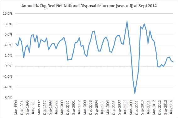
Ann % Chg Real Net National Disposable Income

Source: ABS

The growth in National disposable income has slowed considerably since 2011 and this is likely having an impact on consumption growth.

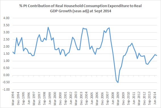
Private household consumption spending is the single largest area of expenditure in our GDP – accounting for 55% of GDP. Household consumption spending growth contributed, on average, 2.2% points to GDP growth during the commodity investment boom years (2000 – 2007). The chart below shows that this has slowed notably since the GFC and again, since 2011. In the last five years, household consumption spending has, on average, contributed 1.4% points to overall GDP growth. There is a risk that this could fall further if income growth continues to slow or declines.

Contribution of HH Consumption to GDP Growth

Source: ABS

Government spending

So far the government has failed to generate support for its May 2014 budget. The proposed budget & reforms have not been approved through the Senate and instead of cutting the deficit, the MYEFO in December showed that the deficit has in fact become larger. According to budget analysis, most of the deterioration has been as a result of a slower economy (and overly optimistic forecasts of commodity prices). The upshot is that the budget is likely to have less of a contractionary impact on the economy. Both monetary and fiscal policy are, in effect, pointing in the same direction. Philosophically, the government is not focused on delivering an expansionary fiscal outcome, but that’s in effect what has been achieved. Unfortunately, if there is any further deterioration in the economy, it will mean an even larger deficit – something that ratings agencies will be watching. Any downgrade to our credit rating could also have a negative impact on local interest rates.

An important theme within the area of government spending is whether the government can successfully implement its infrastructure investment plan and various other structural reforms like taxation. Whilst infrastructure investment would enhance output and likely employment outside of housing and mining in the short term, it would also have long term benefits for business development and future productivity growth. The success of such a program depends heavily on whether the investment is strategic and directed to building the infrastructure that will support sustainable business development, innovation and productivity growth. Budget analysis on the future drivers of income growth highlight that productivity growth will be crucial to offset declines in the ToT and the effects of the ageing population.

More woe to come for our Terms of Trade

There have been two recent indications that we could see some weakness in our external sector when September 2014 GDP is released in a few weeks. Firstly, a continued unfavourable mix of import and export price changes in the Sept quarter point to further declines in our Terms of Trade (ToT). This provides an important indication of continued slower National income growth in the Sept quarter. Secondly, net exports look like it will only make a small positive contribution to overall GDP growth in the Sept quarter according to the latest monthly trade data. Growth in Australian National income and output during the 2000’s has been due, in no small part, to the ToT and the resources investment boom. But as the commodity cycle transitions from the investment to the production and export phase, National income growth has slowed and the degree to which export growth will outweigh the decline in project investment is now unclear. The transition is so far looking bumpy due to falls in commodity prices and what appears to be slower growth in China right at the time that production and export supply from these major resource projects starts to come online.

Import and Export Price Indexes

The release of import and export price data for Sept indicates further declines in the ToT when the National Accounts data for the September quarter is released in early December. The Import and Export Price Index (IPI and EPI) does not use the same methodology to measure import and export prices as the ToT index, but the EPI and IPI provides a fairly good indicator of what the National Accounts will show for the ToT in December. Directionally, the two have moved in sync.

The main highlight is that Export Price Index (EPI) for the Sept quarter continued to fall faster than the Import Price Index (IPI), albeit at a slower rate than the quarter prior:

  • Export prices declined by -3.5% for the Sept qtr, but were down -7.9% in the previous June qtr – therefore Sept was not quite as severe

From an annual perspective, export prices have now declined in three out of the last four quarters, hence the large increase in the annual rate of change:-

  • Export prices have declined by -9.5% for the year to the end of the Sept qtr. The annual change was -1.9% at the previous June qtr 2014


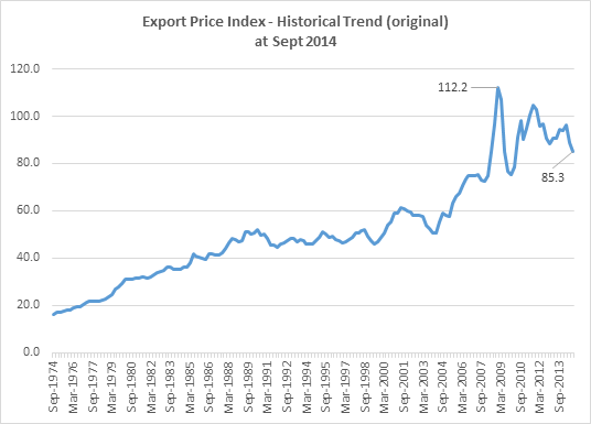
The EPI peaked back in Dec 2008 and the index is now 24% below that peak. In the last 3 years, the EPI is down -18.3%.

Source: ABS

Export price indexes by major export have declined in most cases, with the exception of Gas.

New index weights were applied in Sept 2014 based on export size. Our top five exports represent 64% of total goods exports as at Sept 2014 – Metalliferous Ores 33.24%, Coal, Coke & briquettes 14.38%, Gas, Natural & Manufactured 7.05%, Gold non-monetary (ex gold ores & concentrates) 5.37% and Petroleum, petroleum products and related materials 4.5%.

Export prices in four out of the top five exports declined in the quarter, adding further to annual (and longer term) price declines.

Source: ABS

The exception for the moment is Gas. Export prices for LNG continue to rise, likely still a function of a reasonably tight global market. The development of LNG projects are at a slightly different stage than Iron Ore.

Source: ABS

Investment in new LNG capacity has been part of the growth in resources investment and there are at least six (6) major Australian projects (as well as US, Indonesian and Malaysian projects) due to come online from 2015, adding further volume to total Australian exports and likely adding downward pressure to prices at the same time. It’s unclear the degree to which growth in LNG exports will off-set the decline in project investment spending – an important consideration when thinking about the impact on local aggregate demand.

Some relevant points from the BREE Sept 2014 update:-

“Over the medium term, Australian gas production will more than double. This growth will be underpinned by Australian LNG production which, in concert with rising Chinese gas consumption, will result in a much larger global LNG market by 2019. Supply growth and lower oil prices will also place downward pressure on LNG prices.”

“The growth in Australia’s exports over the period to 2019, underpinned by 61.8 million tonnes a year of new capacity, greatly alters the Asia-Pacific LNG market and is expected to make Australia the world’s largest LNG exporter by 2019.”

“A growing US LNG export sector would increase liquidity in what is currently a very tight global market. This would in turn depress spot prices and place longer term pressure on contract pricing and the mechanisms under which contracts are negotiated.”

Monthly Balance of Trade – September (seasonally adjusted)

Trade data released for September points to only a small positive contribution to nominal GDP growth from net exports in the September quarter.

Source: ABS

Net exports in the June quarter GDP (current prices) was -$4,691m, a large negative turnaround from the +$2,566 net exports figure of the March 2014 qtr. Based on the monthly trade data (which is revised each month as more data becomes available), the current estimate for the Sept quarter is approx. +0.04% pt contribution to GDP growth for the quarter (using the net exports data at current prices from the National Accounts 5206.03 until June 2014). The annual contribution will not be favourable at this current rate either. As mentioned, the trade data is provided monthly and tends to be revised the following month, so should be considered as an estimate until GDP is released.

What made the current quarterly change slightly positive was the fact that, despite lower exports of goods & services of -$621m, imports also slowed in the quarter and are so far estimated to be $984m lower than in the previous quarter. Had imports increased/grown versus the June qtr, then the trade balance would have been worse (and likely detracted from GDP growth) given the quarter on quarter decline in nominal exports.

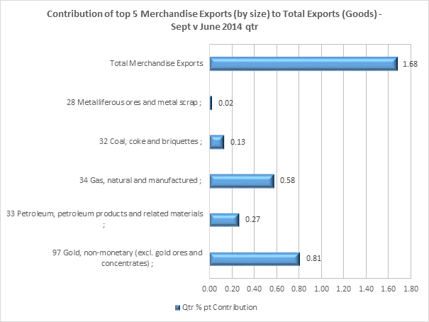
The contributor to the decline in exports was within the ‘Goods/Merchandise’ category. But in order to drill down into the detail, you need to look at data that is not directly comparable – Merchandise Exports by SITC classification using original data, not seasonally adjusted data. The ‘original’ data paints a much more positive view of the status of our goods exports. Using the original data, goods exports grew by 1.68%, rather than the decline of -1.1% that the seasonally adjusted data indicates.

Using the more positive data still highlights that our single biggest export group, Metalliferous ores (28), likely only made a small contribution to overall nominal export growth for the quarter. This is somewhat concerning given that projects are starting to come online and haven’t cycled a full year yet.

Source: ABS 5368.12a

From BREE:

“Iron ore volumes are forecast to increase by 13 per cent in 2014-15, underpinned by a full year of production by recently started mines. However, earnings from iron ore are forecast to decline by 4 per cent because of forecast lower prices.” Source: BREE Sept 2014 Update

On a more positive note, the month on month trend may be highlighting a turnaround in iron ore exports, with the last three months showing improvement in the trend at least.

Source: ABS

With further falls in the ToT likely, National income growth will remain low. The monthly trade data suggests that net exports, despite major mining export projects coming online, may not provide the impetus for higher nominal GDP growth in the quarter. We’ll now have to wait and see what the National Accounts look like in early December.


Consumer prices and the Australian economy – September 2014

Not long ago, I wrote a post arguing why I thought GDP growth was too low. I outlined several reasons in support of this argument: 1) that the pool of unemployed persons has been growing for a duration similar to that of the early 90’s recession and 2) real income per capita was no longer growing. The recent release of Q3 2014 CPI data provides some further evidence supporting this argument. Where aggregate demand is growing faster than its potential rate, demand for resources generally places upward pressure on prices and unemployment declines. The release of Q3 CPI shows that consumer price growth in Australia has started to slow, with growth of core inflation now in the middle of the RBA range of between 2 and 3%. Over the last few quarters, annual CPI growth was at the upper end of the RBA band which seemed at odds with the idea that growth in Australia was too low. There were in fact suggestions that the RBA would need to hike rates. But quarterly CPI growth and other price measures such as wages, commodity prices and Terms of Trade (ToT) have been pointing to an easing in the level of price growth across the economy. Whilst a rate of core CPI right in the middle of the RBA range doesn’t sound like a problem, it’s in combination with indicators such as unemployment growth and income stagnation that point to this as another symptom of a bigger/broader issue.

This situation is not limited to Australia. Globally, price pressures have been easing, with growing concerns of emerging deflation throughout Europe, US, UK and China according to data recently published by The Economist (25th Oct 2014). It’s difficult to pinpoint just one reason for this phenomenon, but slowing global growth is a good starting point. For Australia, the reversal of the ToT boom has been a fairly significant factor associated with slower income growth, growing unemployment and now slowing price growth.

Highlights of CPI Quarter 3 2014

The Sept quarter CPI growth was 0.5%, the same rate of growth in the previous quarter. Quarterly growth at 0.5% is just below the average for Sept CPI growth over the last 10 years of +0.8%.

The quarterly growth trend has been slowing throughout the last four quarters:-

Source: ABS

The annual rate of growth slowed significantly in the Sept quarter from 3% to 2.2% (seasonally adjusted). This large slow-down in annual growth is partly the result of the shift to a higher base used to calculate growth – Sept 2013 quarterly growth was relatively strong at +1.2% (see chart above). That said, the quarterly growth since Sept 13 has been slowing, resulting in annual CPI growth closer to 2% – at the lower end of the RBA range – and reaching this point in a relatively short period of time.

The measures of core CPI growth provide a better guide as to the underlying price growth. Growth in measures of ‘core’ CPI, the trimmed mean and weighted median, eased somewhat in Sept and remain in the middle of the RBA range. The trimmed mean view of consumer prices is the main focus for RBA assessment.

Source: ABS

For the Sep 2014 qtr;

  • Trimmed mean (15% of the smallest & largest price movements are removed or ‘trimmed’) +0.4% quarter on quarter and +2.5% year on year (a slowing of the annual rate)
  • Weighted median (price change at the 50% percentile by weight of the distribution of price changes) +0.6% quarter on quarter and +2.6% year on year (no change in the annual rate)

The biggest contributors to quarterly CPI growth was in Food and Housing categories:-

Source: ABS

The biggest price pressures under Housing were Purchase of New Dwellings and Property Rates and Charges. Both offset the large -0.14 % pts decline in Utilities (Electricity) that also fall under this category.

There was one single significant contribution to growth in Food CPI and that was in the Fruit category.

The big turnaround for the quarter was the slow-down in Health costs, from +0.17% pts last quarter to -0.1% pts this quarter.

Overall, CPI growth is slowing, but for the most part is sitting right in the middle of the RBA range. Based on this, it’s unlikely that there will be pressure to raise rates.

But there is a broader context to this CPI report…

Back in Sept 2012, Assistant RBA Governor, Christopher Kent, gave a speech to the Structural Change and the Rise of Asia Conference titled Implications for the Australian Economy of Strong Growth in Asia. This speech laid out the broad set of factors effecting the Australian economy, namely the impact of economic growth in Asia (China) on driving our Mining boom. The most visible impacts in Australia were the rise in the ToT, an appreciating exchange rate and the growth or “reallocation of productive factors” to resources and resources related industries.

It’s relevant to revisit some of the points of this speech as they relate to the impact on prices and growth now that the positive ‘shock’ to the ToT has started to reverse and the economy has commenced the transition from phase II (investment) to phase III (production and export) of the boom.

“The positive shock to the terms of trade, resulting from a rise in commodity prices, increases income accruing to the resource sector and increases that sector’s demand for productive inputs. Both of these exert a measure of inflationary pressure.” Christopher Kent, RBA Assistant Governor, 19th Sept 2012

“Domestic inflationary pressures, associated with higher wages and incomes, will lead to higher inflation for non-tradable goods and services but, at the same time, the gradual pass through of the initial exchange rate appreciation will lead to lower inflation for tradable goods and services (whose prices in foreign currency terms depend to a significant extent on global considerations). In this way, the appreciation of the exchange rate helps to offset the inflationary impulse from the terms of trade shock, and assists in maintaining inflation in line with the inflation target.” Christopher Kent, RBA Assistant Governor, 19th Sept 2012

We’ve seen all of this happen in the Australian economy.

Firstly, the rise in the ToT generated higher income growth.

Source: ABS

Once the ToT started to appreciate, real GDI started to grow much faster than real GDP – the difference being the impact of the ToT. The ToT peaked during Sept qtr 2011 and is now 21% below that peak. While the ToT did peak, it is still well above its historical levels for the moment – but income growth has stalled nonetheless. More on this later.

Secondly, the exchange rate did appreciate during the investment phase of the boom.

Source: RBA

The real AUD TWI appreciated during the years between 2000 and 2011, with the exception of 2008/9 (GFC). Growth in the exchange rate started to slow from June 2011 but importantly, remained elevated until it peaked in March 2013. Since then, the real AUD TWI has fallen by 7%.

Finally, there was greater inflationary pressure in the non-tradable sector than the tradable sector (see definitions and detail of each here) during the period of the investment phase of the Mining boom.

Source: ABS

It’s hard to look at this chart and ascertain a ‘neat’ relationship between exchange rate changes and annual tradable inflation. The range for tradable CPI growth has been between +4% and -2% during this time, but has generally been lower than non-tradable inflation growth. This can be shown more clearly by reproducing one of the charts from the RBA speech – the ratio of non-tradable CPI to tradable CPI.

This first chart is from the RBA speech as it provides the historical context. The second chart is updated using the latest data (with as much history as available from the ABS).

This first chart reinforces that since the start of the ToT boom, non-tradable inflation has grown much faster than tradable.

The updated data show a fairly important change in that trend – non-tradable CPI growth started to slow from March 2013:-

Source: ABS, The Macroeconomic Project

This is an unusually long period of no change in this ratio, given the growth in non-tradable CPI during recent history. Prices are still growing, but at a slower rate and this is could be an important indicator of slower demand in the domestic economy.

Since June 2013, non-tradable CPI has started to contribute less to total CPI growth. In Sept 2014, non-tradable CPI made its lowest contribution to total CPI growth (contribution data is only available back to June 2012). Since June 2012, tradable CPI also started to have an increasingly positive contribution to CPI growth, but it too made a smaller contribution to CPI growth in the recent quarter. Both tradable and non-tradable CPI slowed in the latest quarter:-

Source: ABS

There are 47 categories classified as ‘tradable’ – which contributed +0.76% pts to CPI growth. In over half of those categories (26), prices are either flat or declining (YoY -0.39% pts), 17 categories contributed +0.31% pts and the top 4 categories contributed the bulk of the price growth +0.86% pts. The categories were Tobacco, Fruit, Vegetables and International Holiday & Travel. The increase in Tobacco prices is due to an excise increase.

By contrast, there are 40 categories classified as non-tradable, which contributed 1.58% pts to overall CPI growth. In only 12 out of 40 categories are prices flat or declining, contributing -0.26% pts to overall growth. The bulk of the growth in non-tradable CPI comes from the ‘middle’ 24 categories which contributed +0.94% pts. The top 4 non-tradable categories still punched above their weight adding +0.87% pts. The top 4 categories are (in order) Purchase of New Dwellings, Medical & Hospital Services, Rents and Other Services in respect of Motor Vehicles.

There is broader pressure i.e. more categories contributing to CPI growth, in the non-tradable sector and our housing market (new dwellings anyway) is driving one of the biggest parts of that growth.

This brings us to the present day – and we are now seeing the opposite effects take place as the ToT boom reverses.

As mentioned earlier, the ToT has declined by 21% from its peak and the most important thing about this in relation to the CPI is the impact on income growth. The most accurate representation of the income effect is to look at Real Net National Disposable Income (NNDI) per capita. During the ToT boom (2000-2011), growth averaged 2.9% (not including the GFC). Since the ToT peaked in Sept 2011, income growth has averaged 0%.

Source: ABS

In per capita dollar terms, real NNDI has declined by -2.6% since its peak in Sept 2011 (ToT peaked at the same time). This isn’t a huge drop (the chart above measures growth not the per capita value) and the decline is not a short and deep correction that you would see associated with a recession, but rather, income growth has stagnated (at best) over a somewhat extended period of time. Unfortunately, further declines in commodity prices are expected and this is likely to maintain pressure on income growth. If National income growth remains low, it’s likely that CPI growth, especially non-tradable CPI, will continue to slow.

Unfortunately, the exchange rate stayed high during the initial falls in commodity prices and the ToT (the ToT started falling from Sept 2011 and the real AUD TWI only started to decline from March 2013). Elsewhere in the economy, it’s likely that the final stages of the Mining investment phase, a continued housing boom (which requires some funding from overseas markets to maintain loan growth) and relatively higher interest rates in Australia since the GFC have kept the exchange rate higher than expected. This has placed some local non-resources industries and the resources sector (due to falling commodity prices and the scramble to cut costs) at a disadvantage. So far the real AUD TWI has only fallen by 7% and the AUD/USD has fallen by 20% but remains above the level that the RBA deems as its ‘magic spot’ of between US$0.80 and US$0.85 (SMH, IMF: Australian dollar should trade at ‘low US80¢'” 25-27 Jan 2014).

This is not a recessionary period and total output has not declined, but activity/growth has slowed. For the moment, income growth per capita has stopped, unemployment continues to rise and price pressures are starting to ease in the domestic economy as our ToT boom reverses and global growth remains low. This situation is likely to continue, if not become worse, as further falls in our ToT are expected. From a policy perspective, it’s unlikely, given this environment, that the RBA will increase interest rates in the short-term. Depending on the size/severity of changes in the ToT, it would be more likely that the next move in the official cash rate will be down.

The huge elephant in the room remains the ongoing strength of the Australian housing market.